Spooked
A social web app for the discerning horror fan
tl;dr
This is an ongoing project. The clients need help revamping their designs for a web app catered to horror movie fans who want to avoid watching certain types of scenes. So far, I've worked with them to update the site's branding and to better define its primary features.
Problem
Some fans of horror films want to be selective of the films or scenes they watch, but when they look up any information about a film's content, it's difficult to avoid spoilers.
Solution
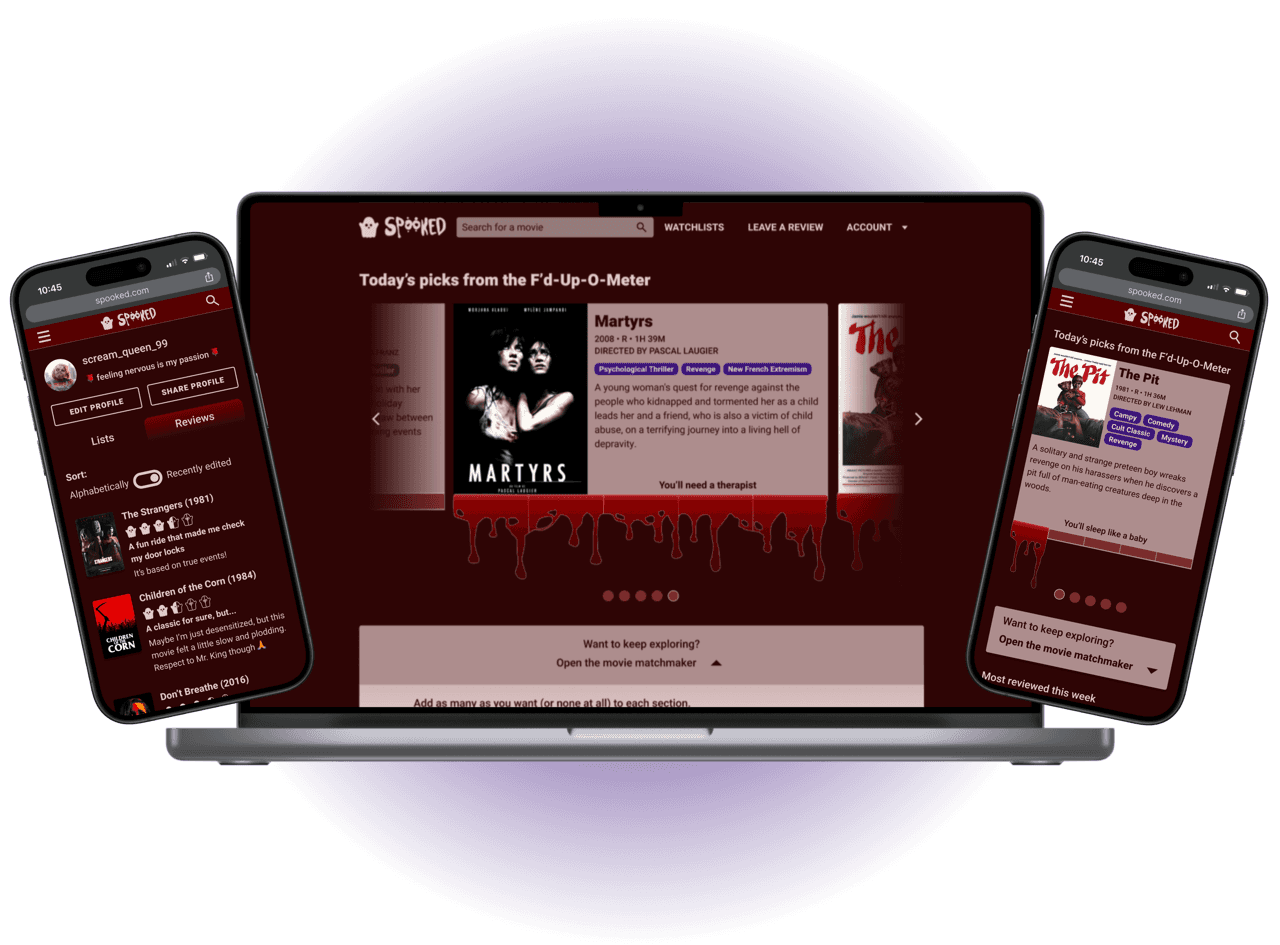
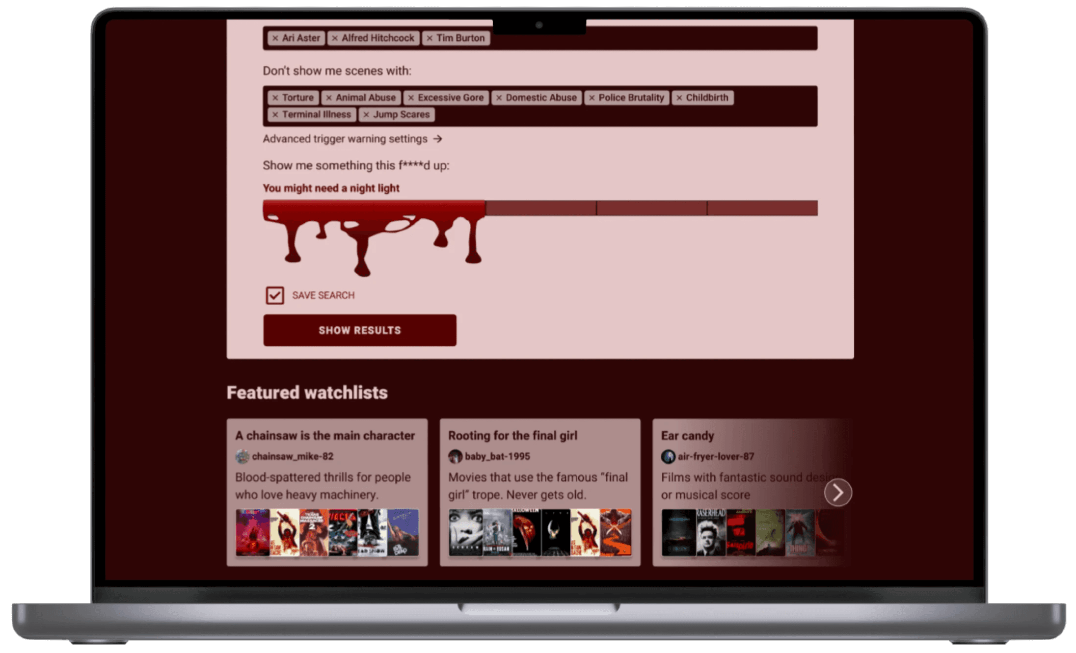
For the project's MVP, we created a Movie Matchmaker that helps users find exactly what they would enjoy, a group-sourced metric called the F'd-Up-O-Meter which rates films based on how scary they are, and a way to leave detailed, nuanced reviews.
Role
UX/UI Design
Industry
Entertainment
Client
Jim and Rachel C.
Tools
Figma/Figjam
Adobe Fresco
Date and Scope
Ongoing; case study contents:
July - Oct 2023
Approx. 90 hours
Constraints
Work within clients' vision for the product, starting from an existing simple web app
Content is limited to films of the horror genre
Improving a web app for a bloodthirsty user group
Whether being watched for the adrenaline rush, the artistic merit, or to briefly escape the anxieties of real life, horror films appeal to a large and dedicated fanbase. The genre spans a wide spectrum of themes from thrilling, campy silliness to disturbing content that stays with viewers long after the film ends.
Viewers go into a horror movie expecting a certain amount of edginess, but even the most seasoned fan might avoid watching particular types of scenes.
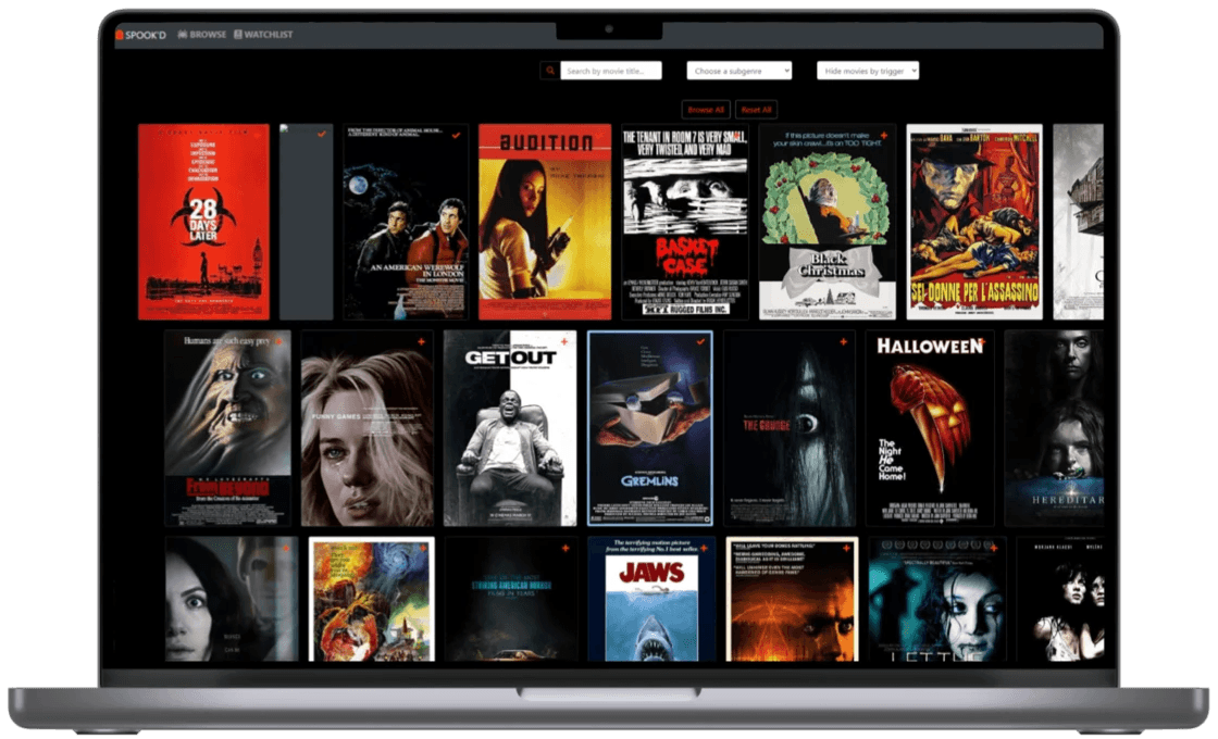
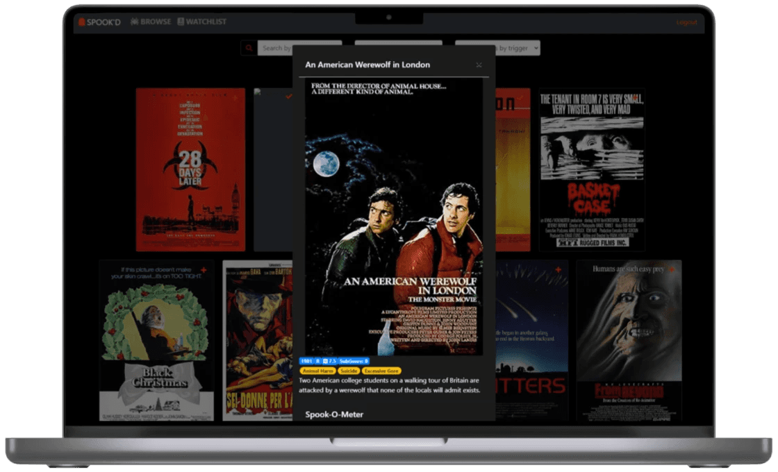
A couple of the original screens for “Spook'd.”
The existing web app, originally spelled “Spook'd,” is a simple locally-hosted app that uses a custom-made database. Currently, users can see a full list of movies and then filter them based on subgenre and emotional trigger. A unique element that the clients want to preserve is an “F’d-Up-O-Meter”, which is a measure of a film’s overall disturbingness at a glance.
I had these overall goals for this project:
Determine the most effective way for users to find the horror movies they enjoy while filtering out themes that are personally distressing to them.
Work with the clients to determine what improvements to Spooked's existing features and UI would be most useful and appealing to users.
Create designs for responsive screens.
Hand off detailed design specs to the stakeholder, who is also the site’s developer.
What do horror fans want in a social movie app?
These were my objectives for learning about people's movie watching habits:
Learn about how similar apps or sites solve the original problem (displaying info about content warnings without displaying spoilers) if at all.
Discover if and how people keep track of what movies they want to watch/have watched.
Understand what is lacking in current methods of learning about and/or documenting horror movies.
Movie fans have personalized dealbreakers
Before beginning my research into similar apps in the Entertainment space, I needed to get a good idea of which apps and sites horror fans are already using.
I spoke with five people, male and female, who are self-identified horror fans living in the US. Some were more casual fans than others. I conducted all interviews remotely.
Some of the questions I asked them included:
What do you like and dislike about the horror genre?
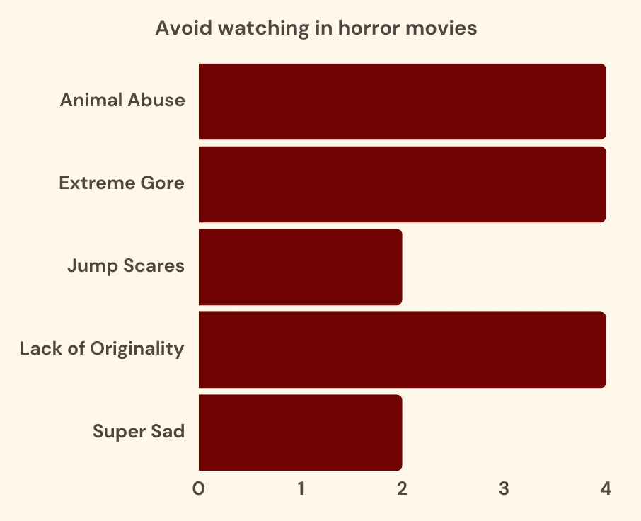
Is there anything you try to avoid seeing in horror movies? Why or why not?
How do you decide what to watch?
Is there any factor other than an emotional trigger that would make you want to avoid watching something?
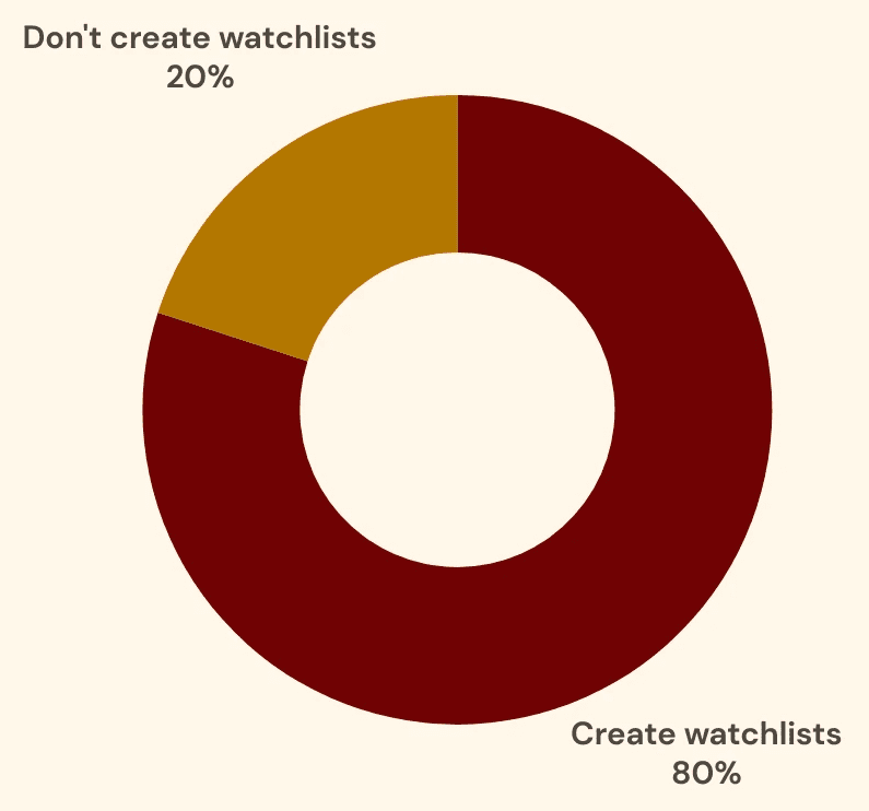
Do you have a way of keeping track of what movies you want to watch and have watched?
Out of 5 interviewees:
Interviewees readily provided ideas for what they'd appreciate in a movie-finding app for horror lovers, including opinions on Spooked's existing main features.
“The people in Letterboxd are so snobby and rate movies so low…. So I wish Rotten Tomatoes and IMDb were built in. I feel like those tend to be more accurate representations of how I feel about a movie.”
“It's hard to find people who really like [the horror genre]. And most of the time people are like, No, I'm not watching that with you. So I’ve spent a lot of time watching it alone. And I really enjoy when people want to talk about horror.”
“I think [the F'd-Up-O-Meter is] a great feature because I think there's a lot of people who would start at the top of the most f****d up movies. Which is something that I would probably do…. It’s a very novel idea.”
“[Timestamps of sensitive scenes] would be SO helpful…. If I could just watch a movie for the first time …. and I just know when to look away automatically, that's great. And I'd be much more likely to watch movies with those triggers then.”
No product fills the niche observed by the clients
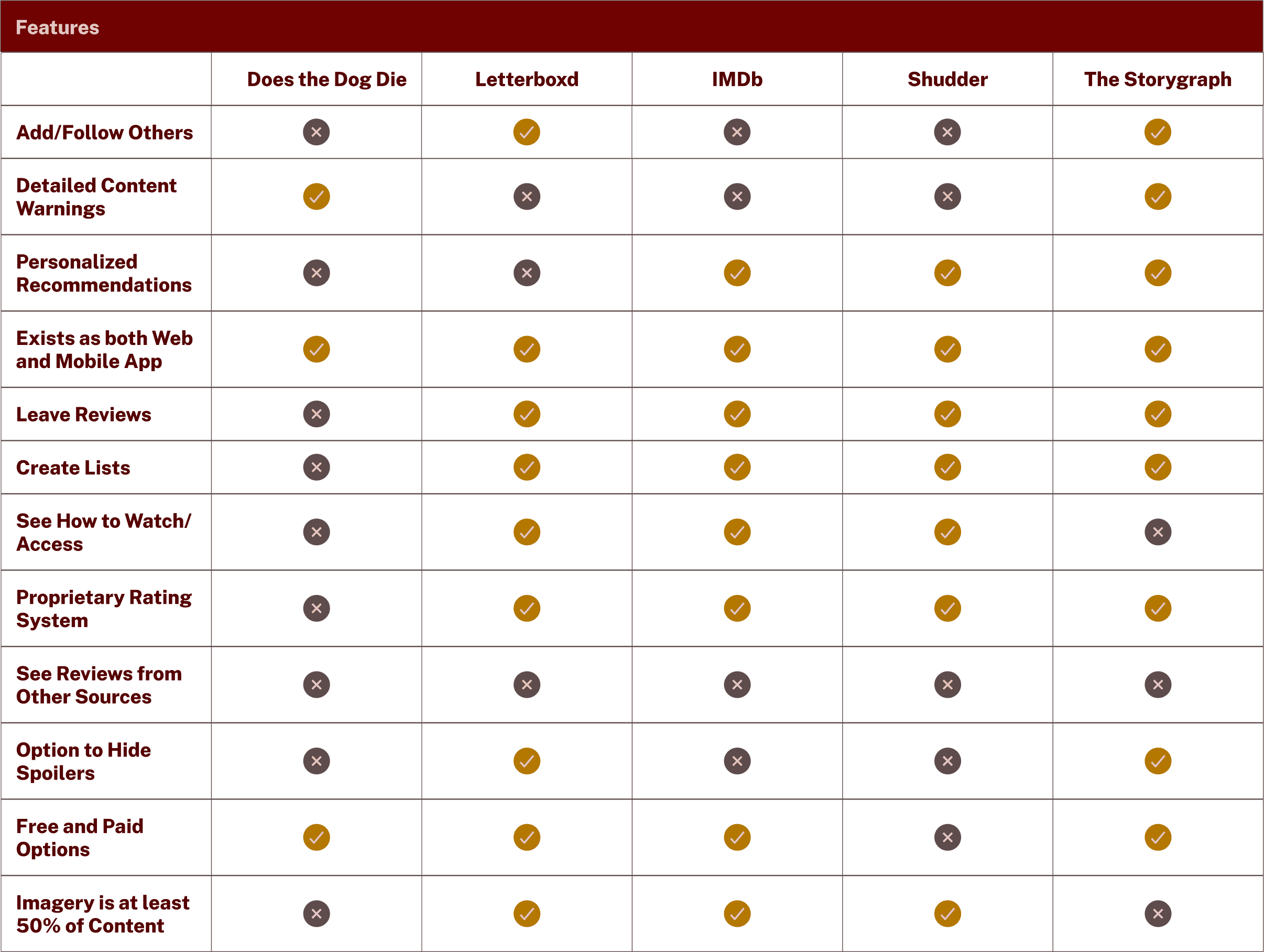
When looking to industry leaders for inspiration, I found that not many apps or sites exist that are dedicated to the Horror genre specifically, but plenty do for reviewing and organizing films in general. Movie apps have a lot of crossover with book apps.
Some opportunities I recognized after comparing these products:
There is currently no service that provides spoiler-free content warnings for horror films.
Storygraph’s rating system could be an inspiration for a movie web app.
Each movie rating system has its own rules, and users may benefit from seeing ratings on the a few popular rating sites side by side.
clearly defining the project's users and star features
Types of horror fans and what they crave
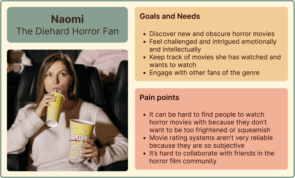
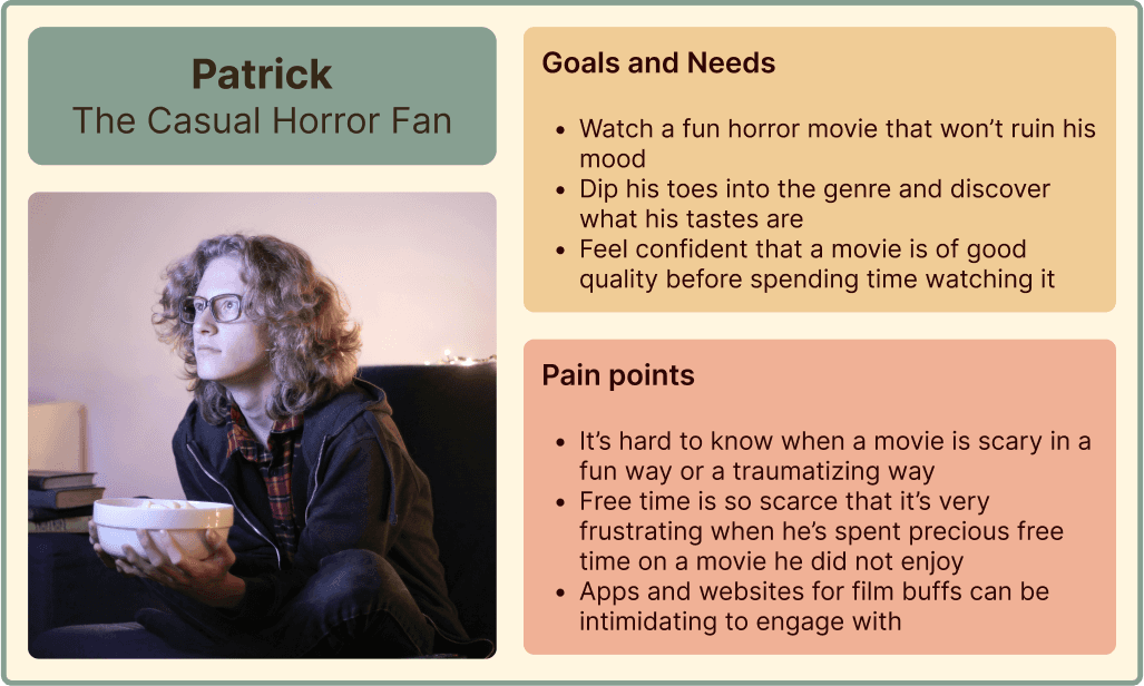
The user interviews showed me that horror fans exist along a spectrum of casual to intense, so I created two personas. They also share some needs and pain points.
I crafted a few How Might We questions for each persona, and some for both.
Photo by Pavel Danilyuk
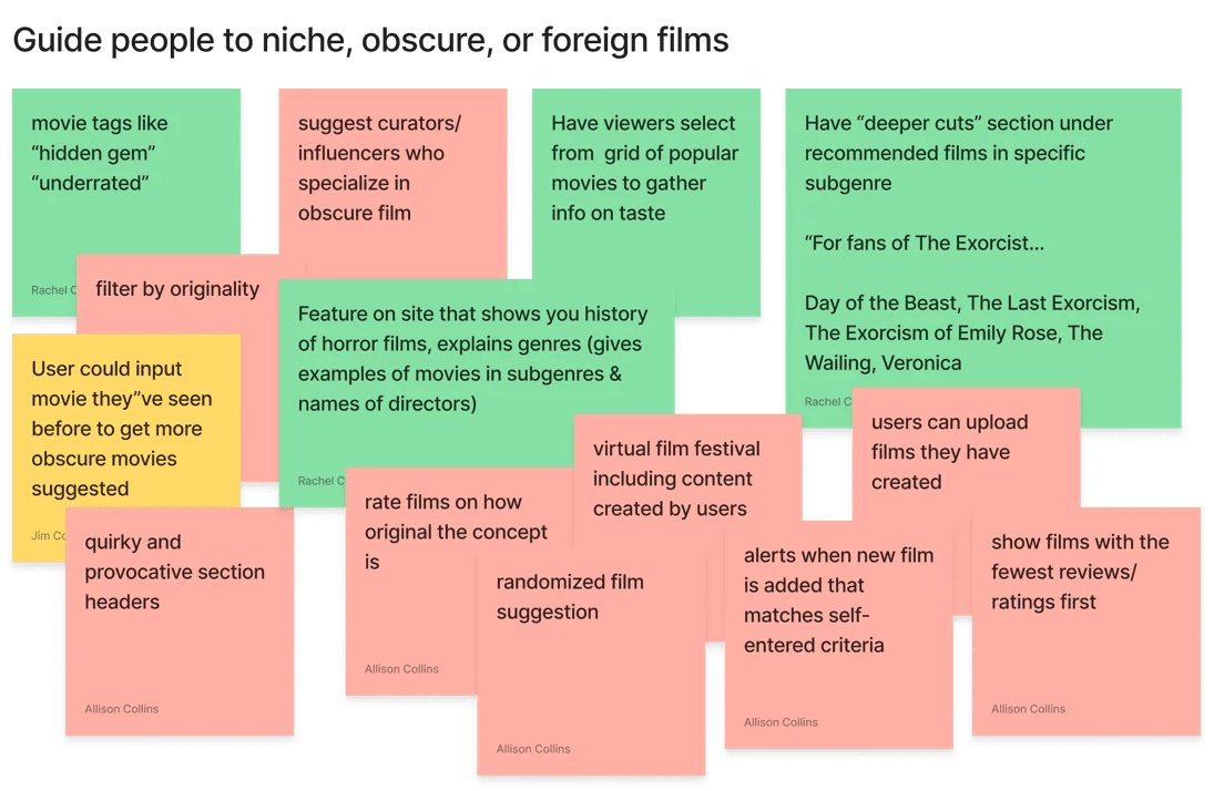
How might we guide her to niche, obscure, or foreign horror films that she would enjoy?
How might we enable her to collaborate with other horror fans on movie watchlists?
How might we help her to organize her collections of movies that she’s watched or wants to watch?
Photo by Andrea Piacquadio
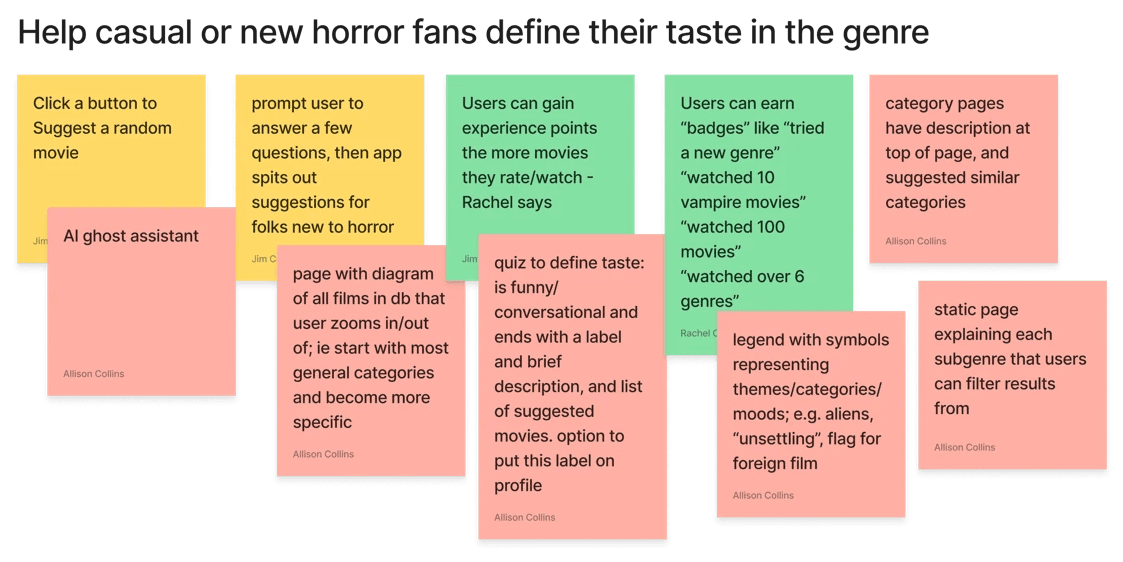
How might we help him understand the subgenres of horror films in an approachable and entertaining way?
How might we help him define his taste in the horror genre?
HMW questions for both users:
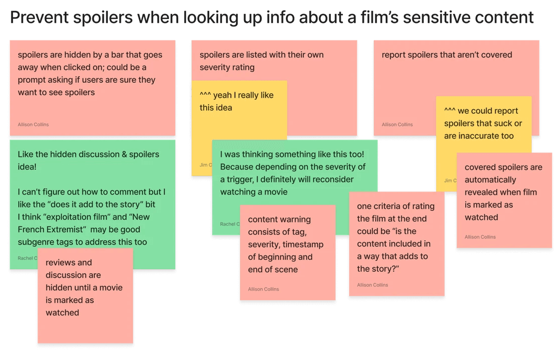
How might we prevent spoilers when they are looking up information about a film’s sensitive content?
How might we encourage engagement from all types of users, from horror film buffs to casual watchers?
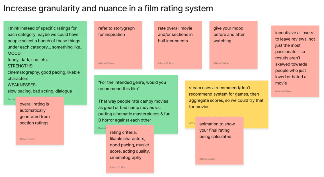
How might we increase granularity and nuance in a film rating system?
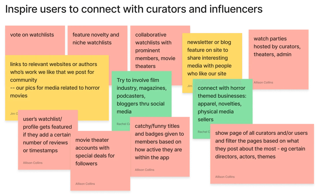
How might we inspire them to connect them with curators and influencers?
Group brainstorming provides a clearer path
Even though the clients knew what they wanted their web app's basic functions to be, they were open to exploring different ideas of solving their original problem. They also wanted to define the app's social element better.
With the HMW questions as inspiration, we had a brainstorming session to come up with as many ideas as we could per question in a given time limit. This would be the starting point for defining our feature set.
After coming up with these ideas, we sorted them on an Effort vs. Impact matrix. While we hoped to incorporate the most ideas that we could from the low effort/high impact section, many of these ideas were ultimately relegated to features that can come later.
This exercise helped to initiate constructive conversation about how the features should look. We left the exercise with a good idea of what we wanted to include in the MVP.
building out the core spooky features
We knew that we wanted these core features to be in the project's MVP:
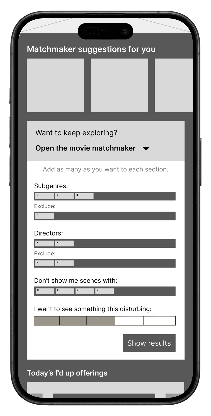
Movie Matchmaker: search for film by title, director, subgenre, and/or emotional trigger
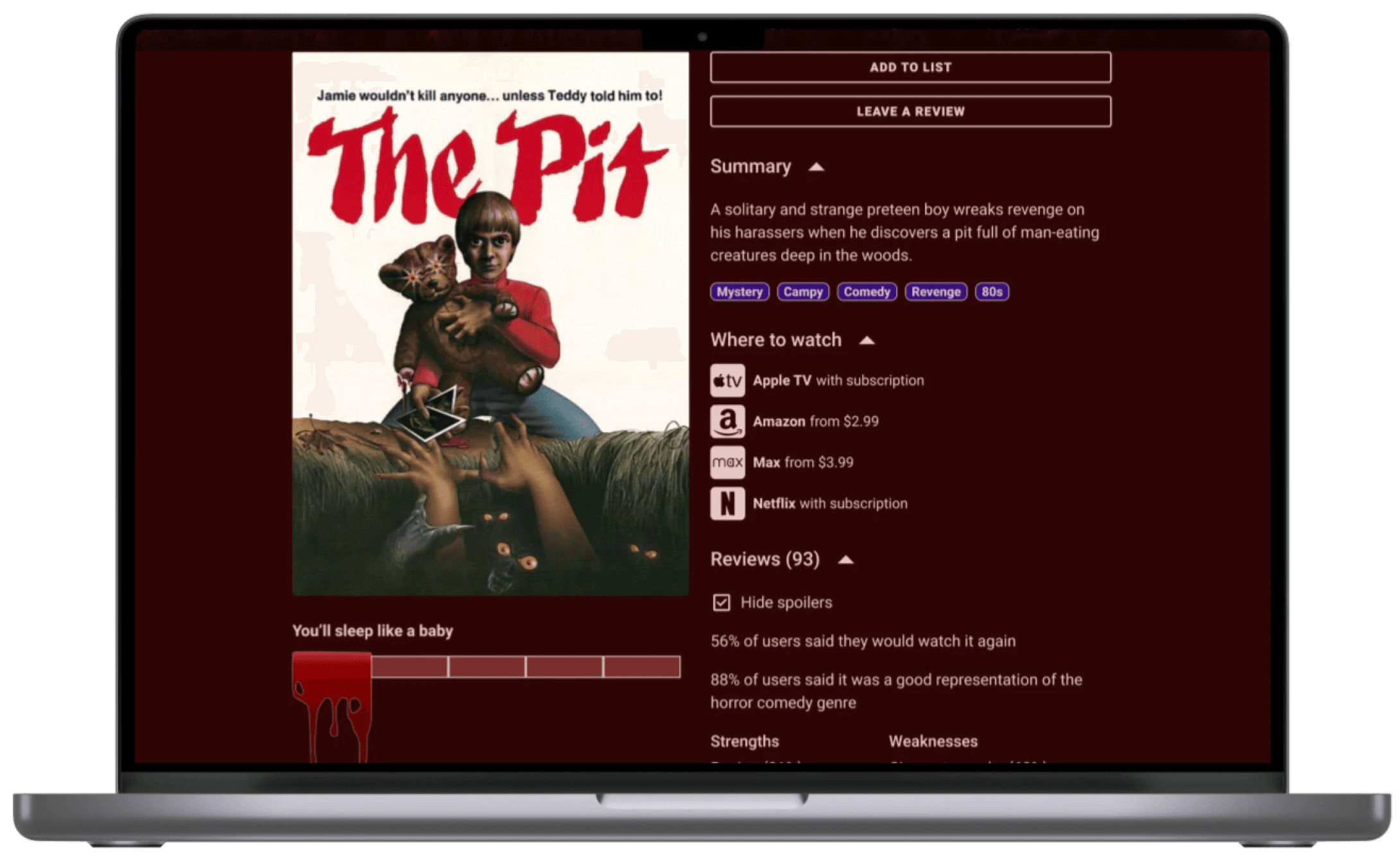
F'd-Up-O-Meter: metric of overall disturbingness
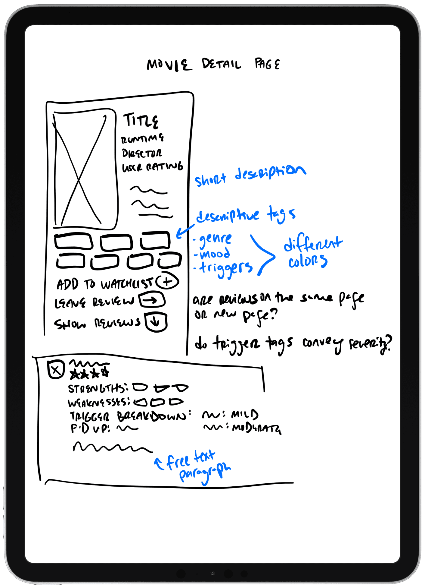
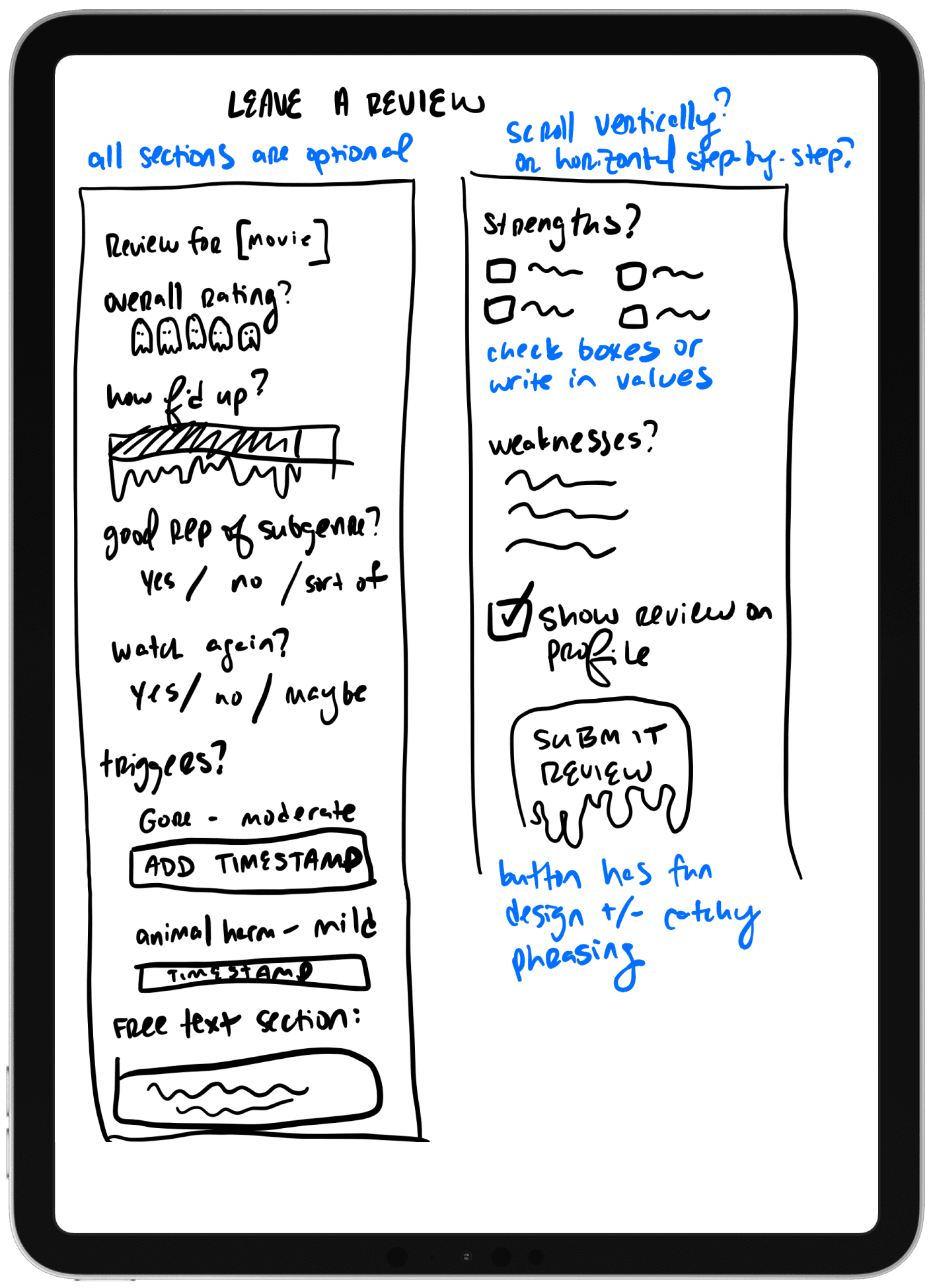
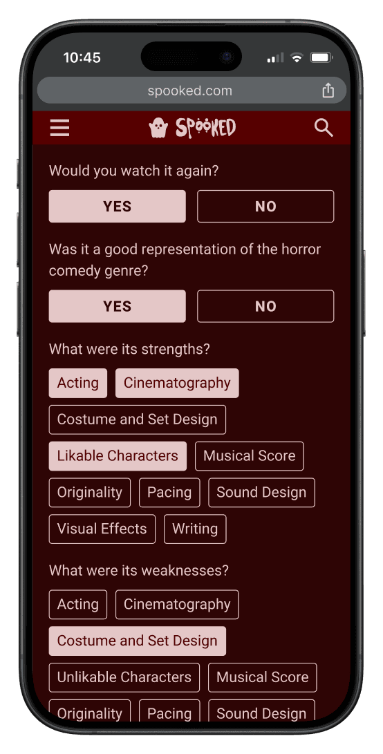
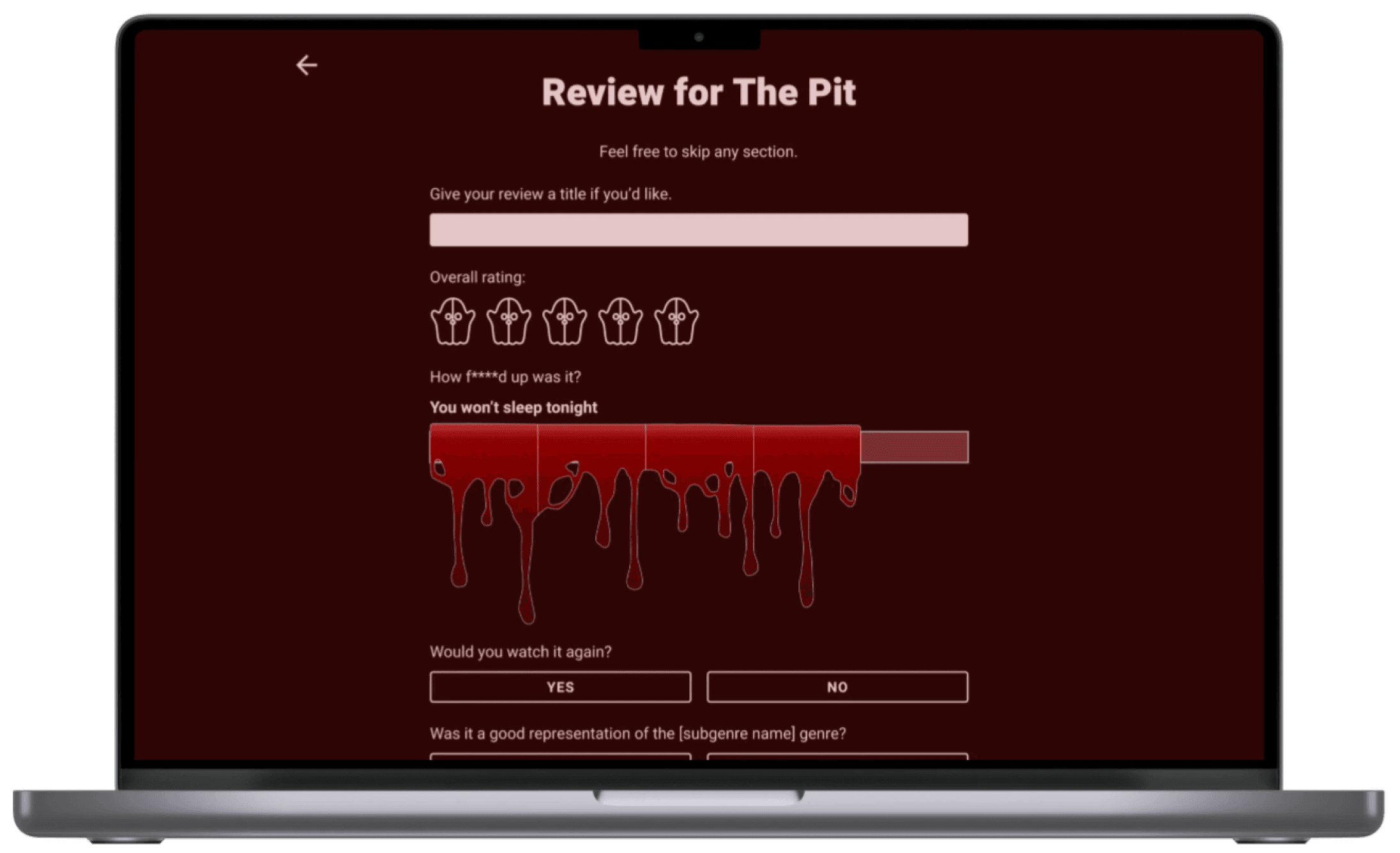
Nuanced reviews: ratings and reviews can include detailed information about sensitive content
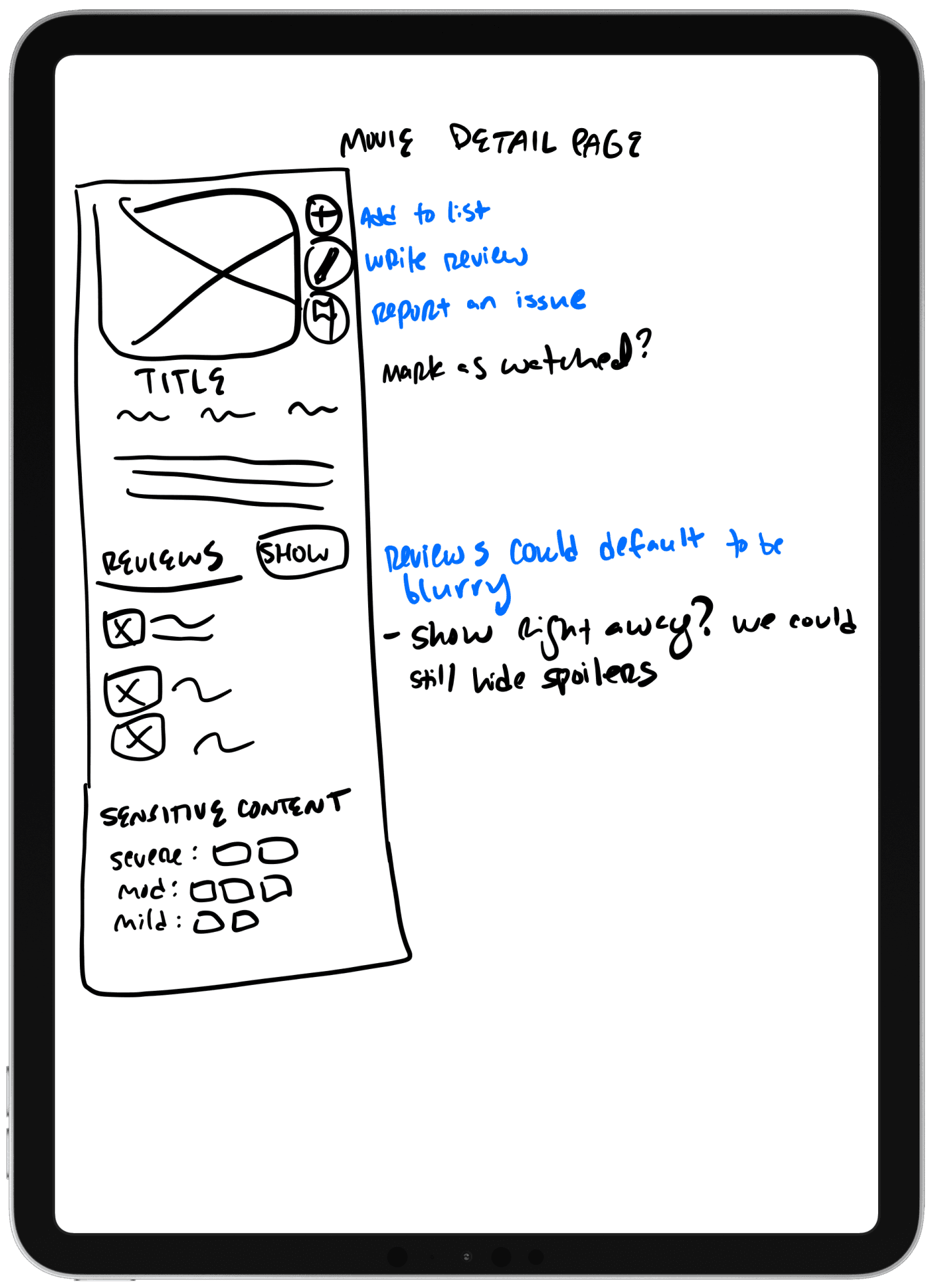
Option to hide spoilers in reviews somehow
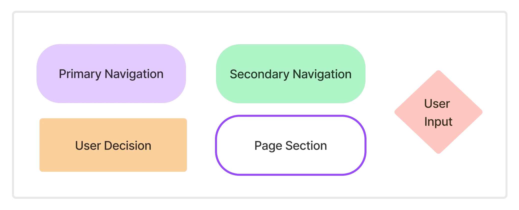
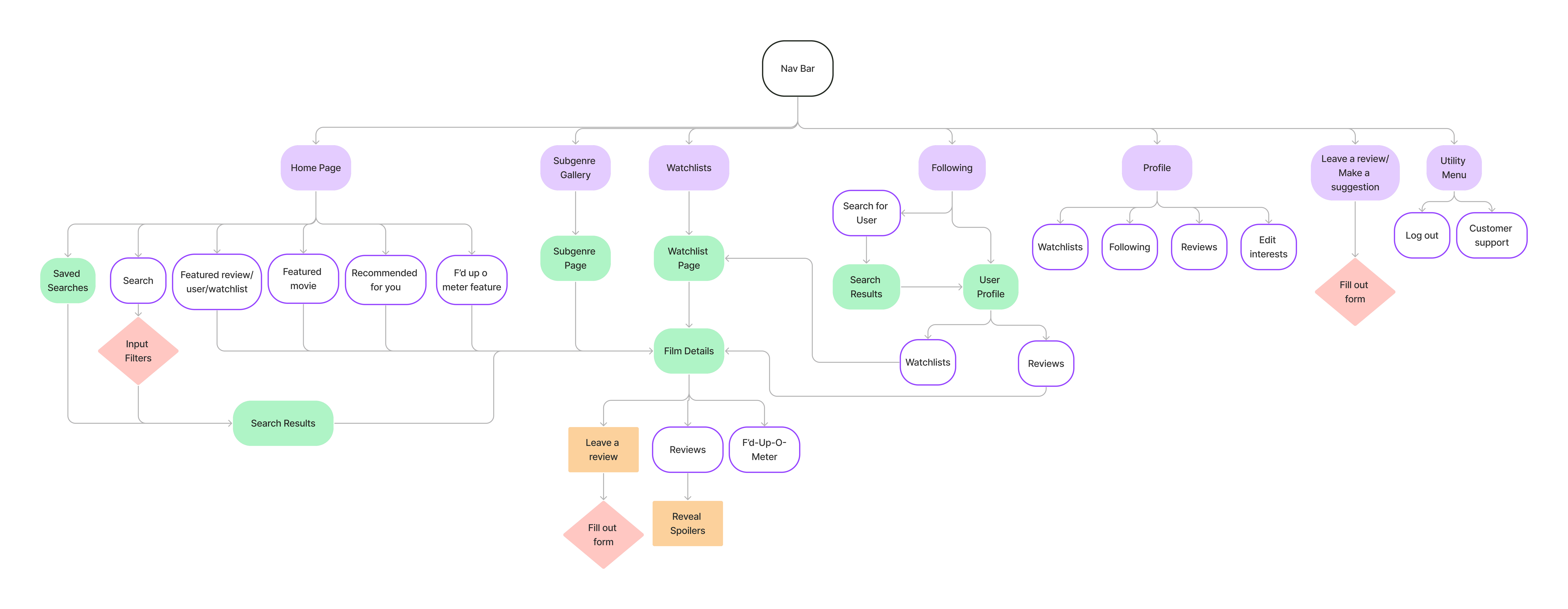
Sitemap
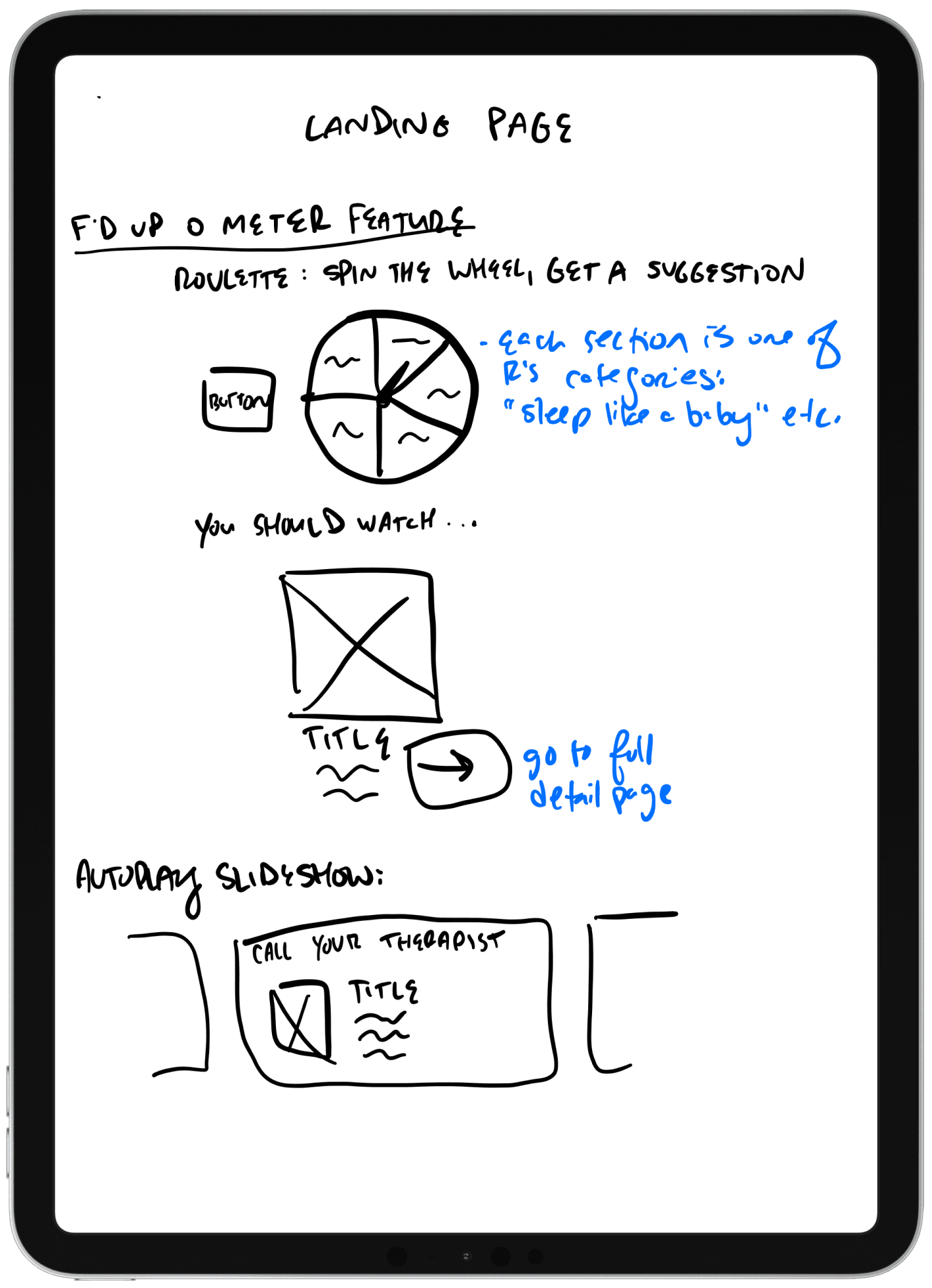
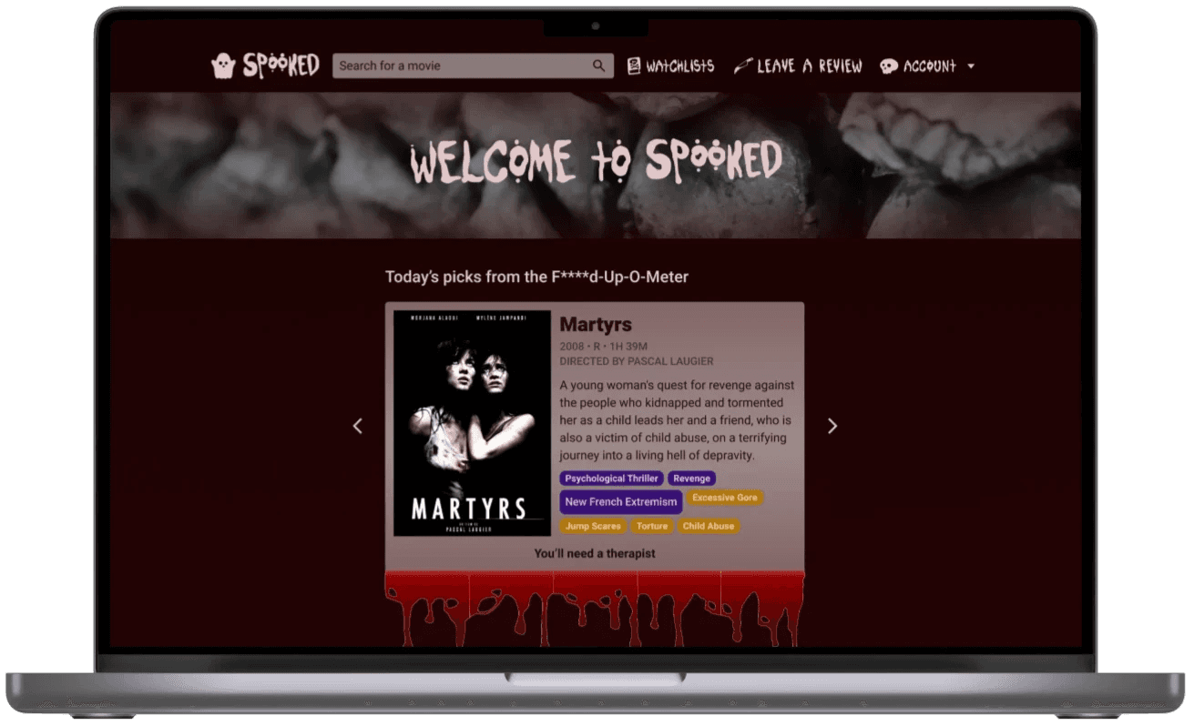
Here, I had to consider how to make the site's hero features prominent, including how to feature the F'd-Up-O-Meter on the landing page.
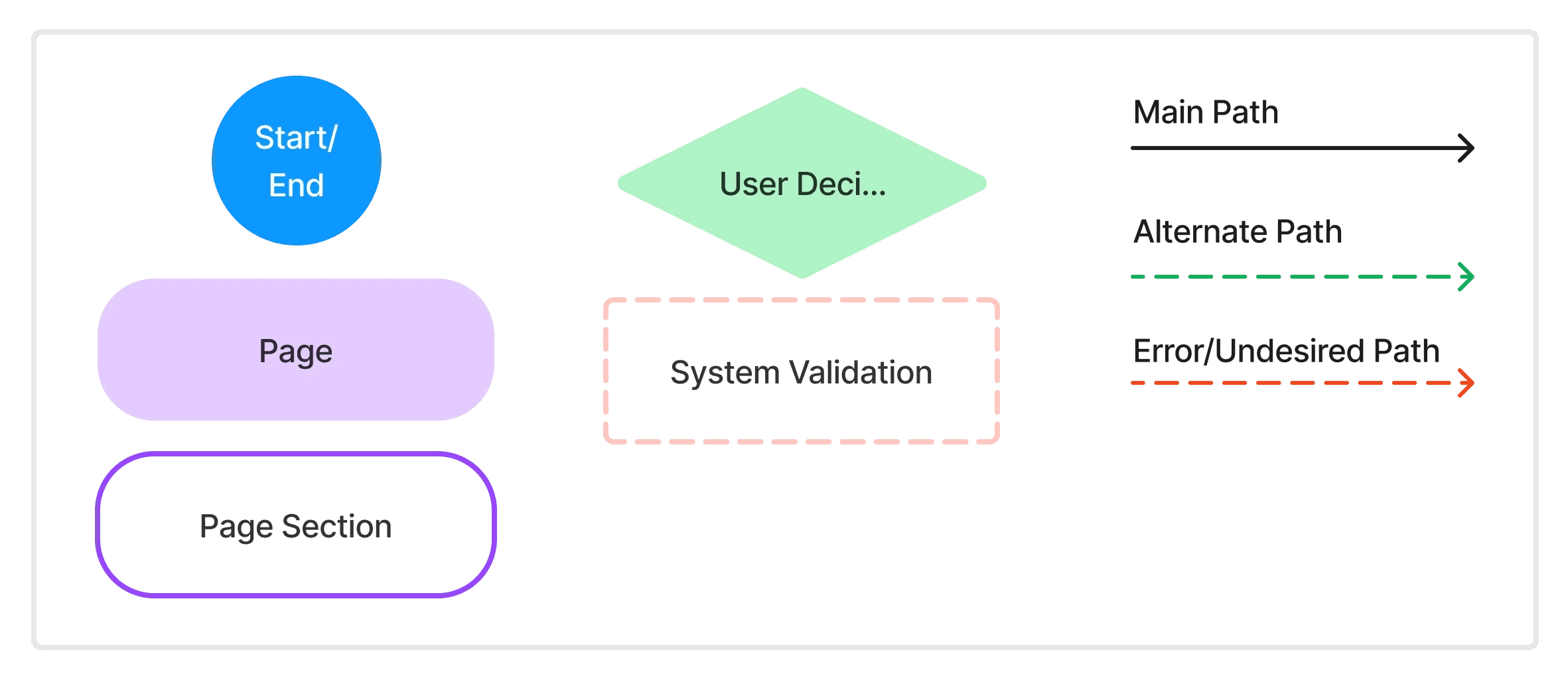
User Flows
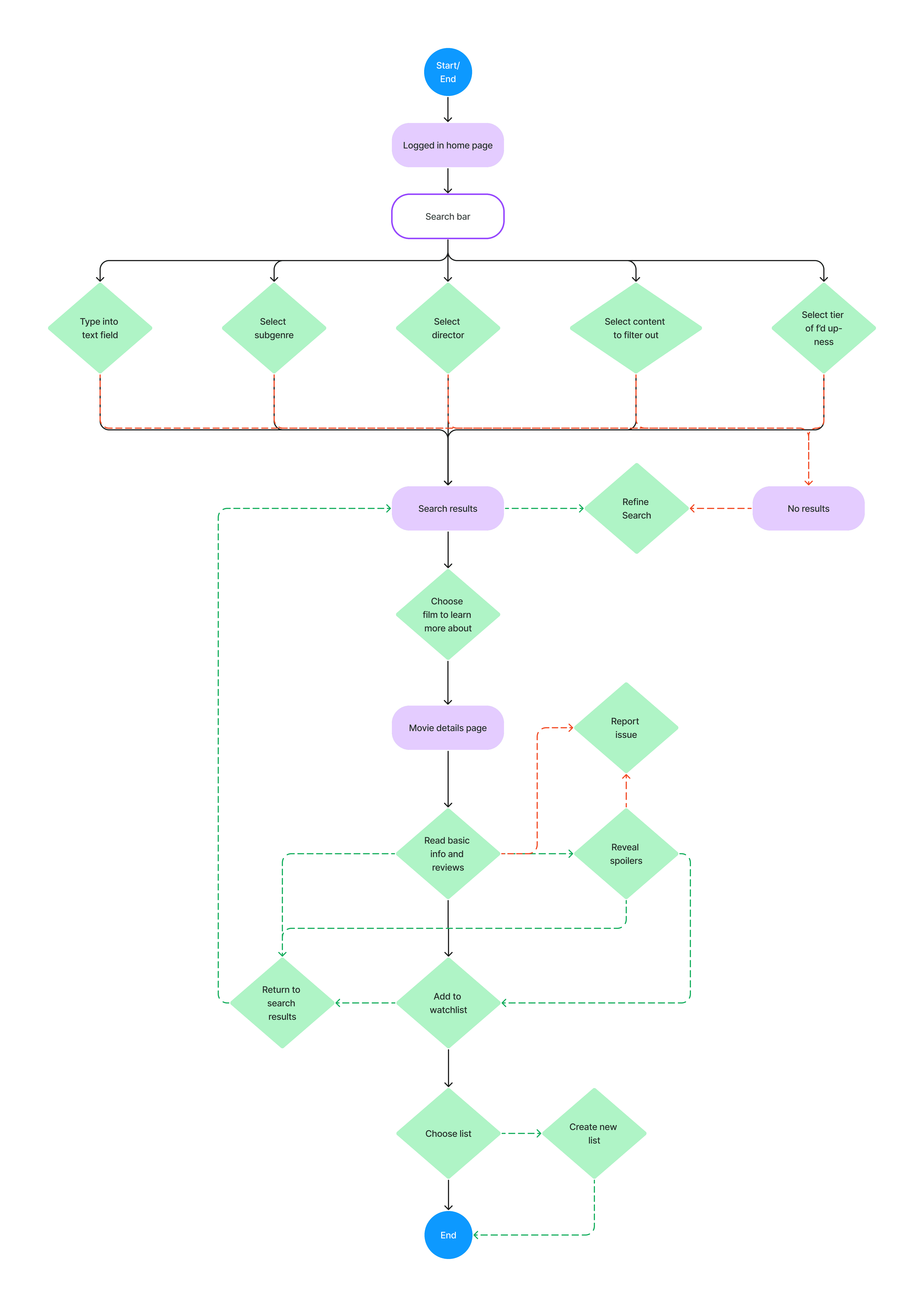
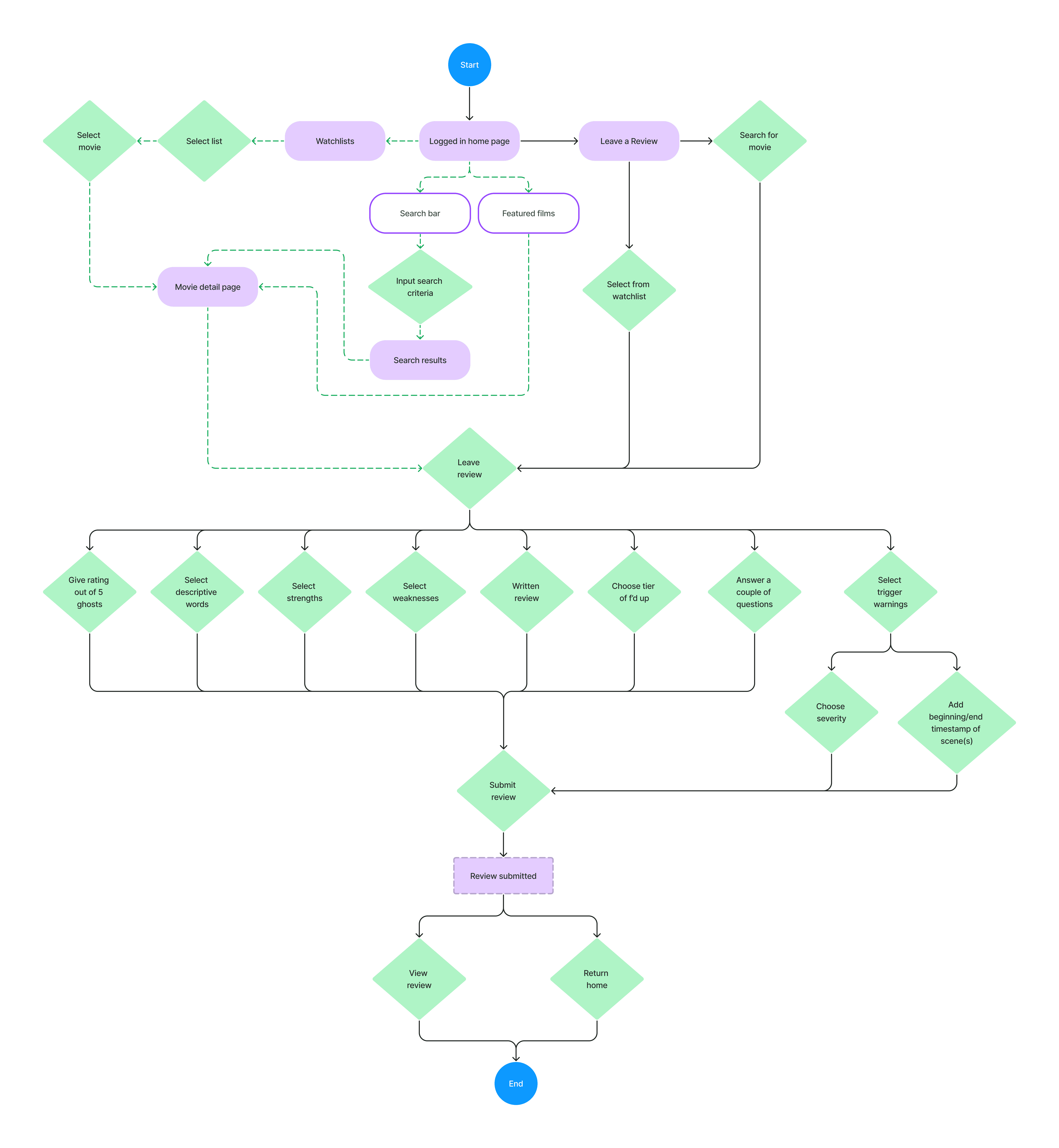
In focusing on these 2 user flows, we would be testing Spooked's 3 core features.
Use the Movie Matchmaker to find movie recommendations
The clients wanted to be sure that users could search for titles based on subgenres, directors, and triggers to avoid.
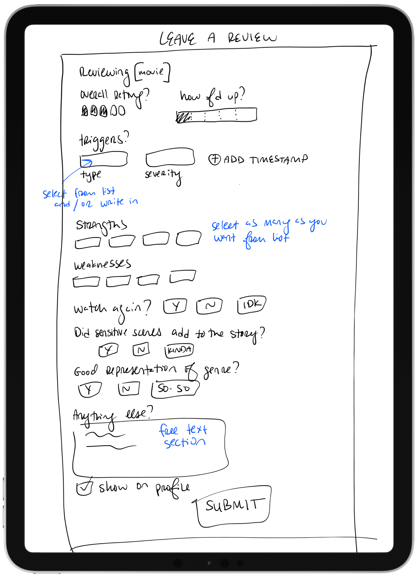
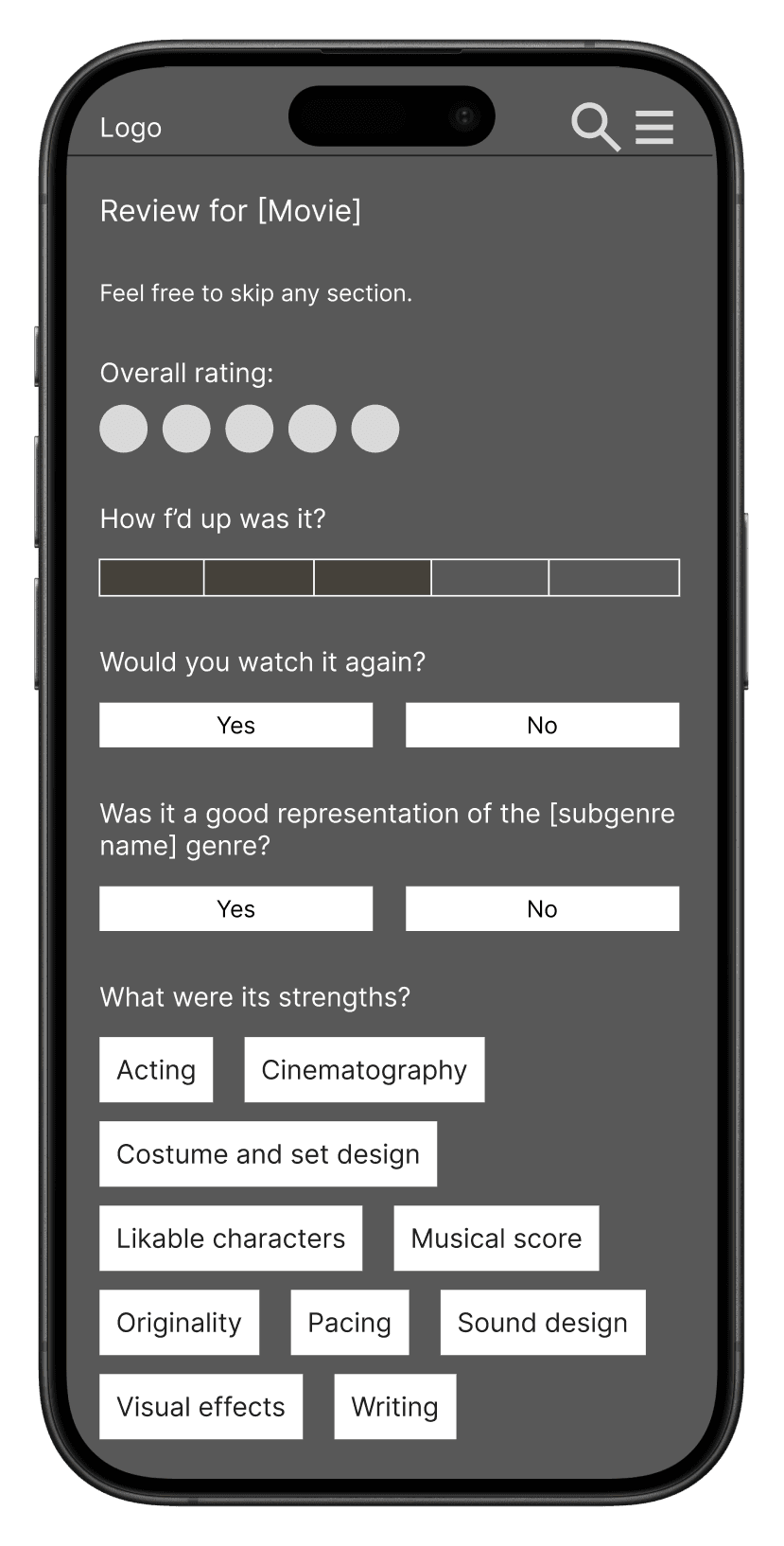
Leave a detailed review
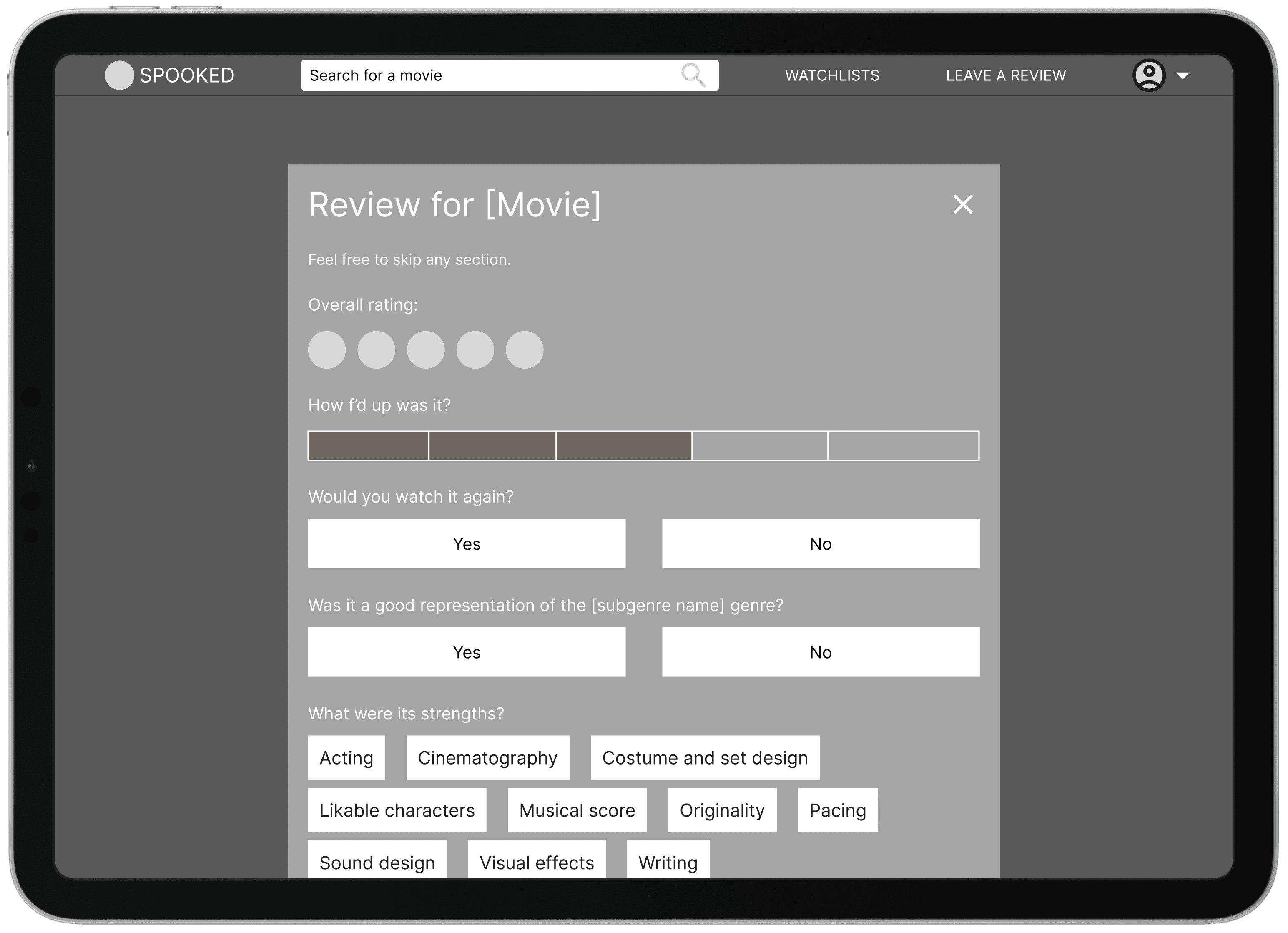
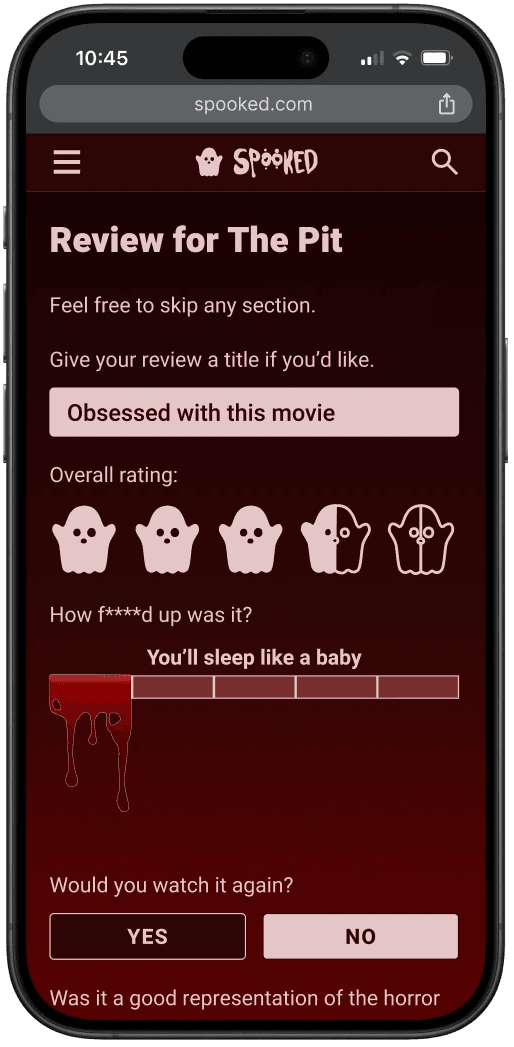
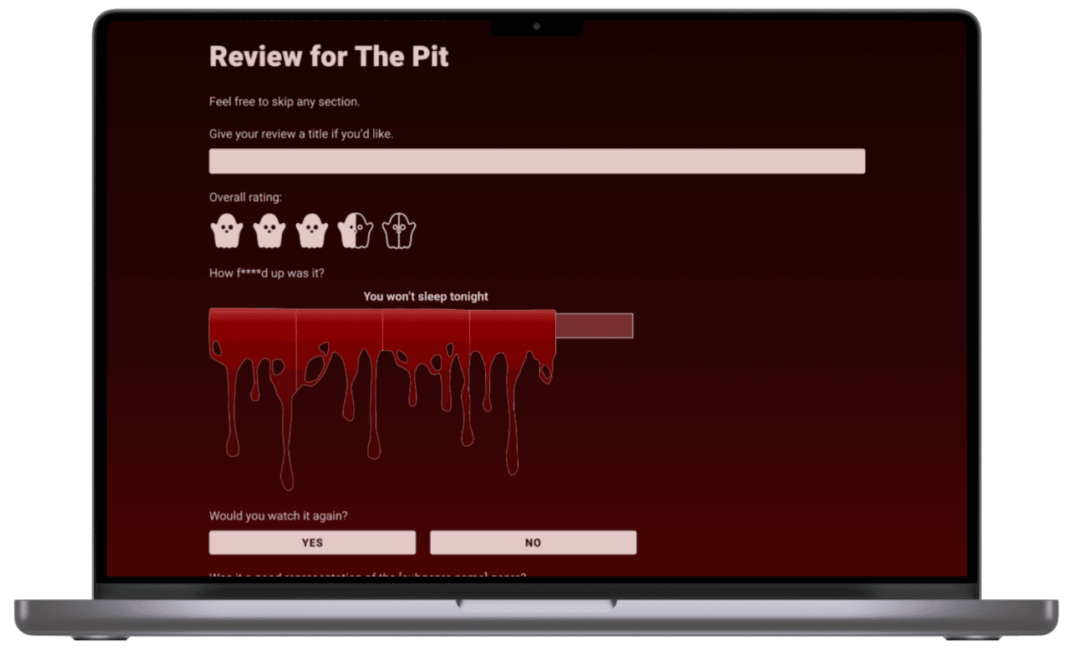
I wanted the experience for writing reviews to leave users feeling satisfied about saying their piece, but not overwhelmed with the amount of detail on the screen.
Zhuzhing up the original UI
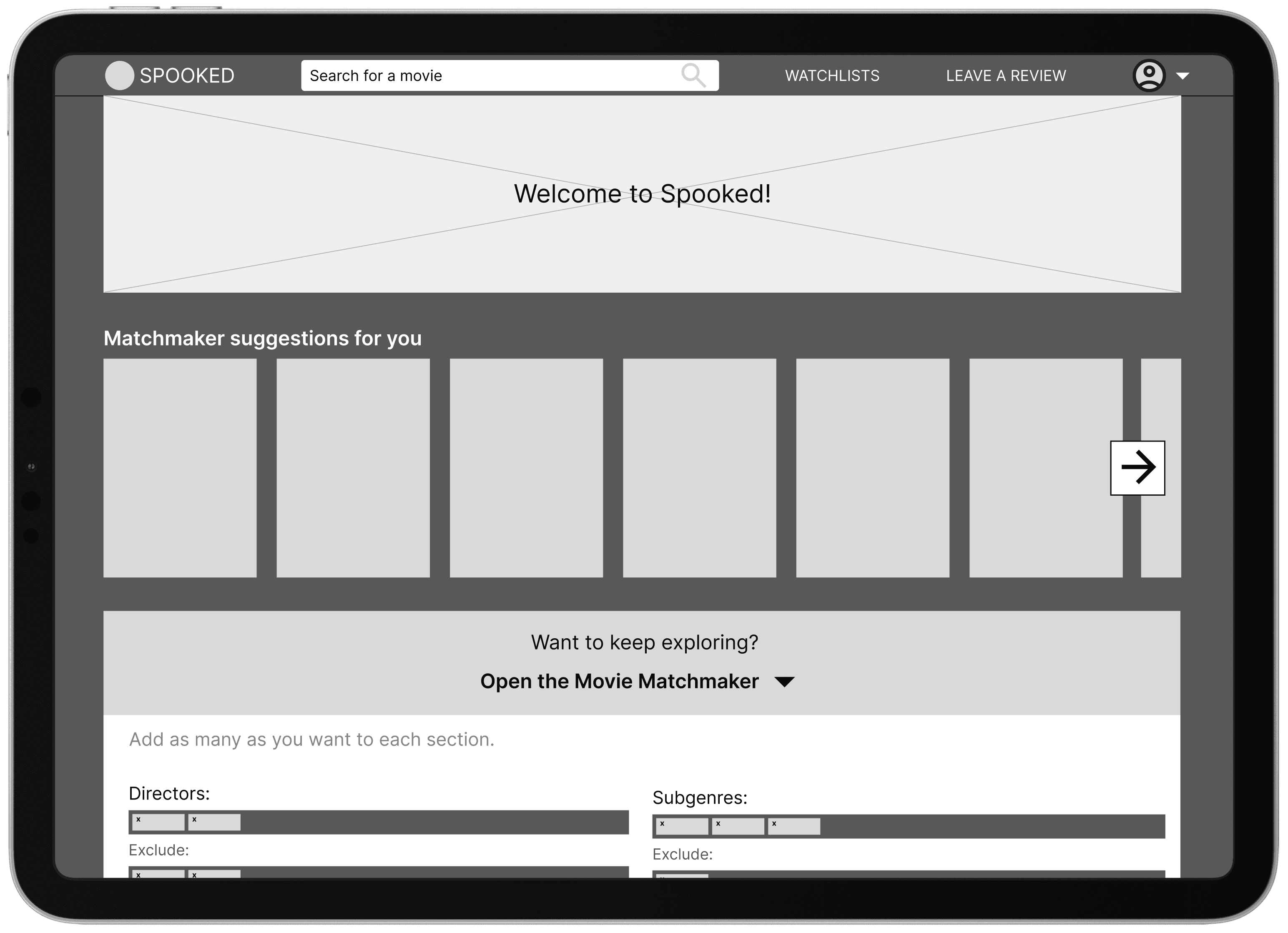
Since this web app is intended to be mobile-first, I focused on designs for mobile screens. For the desktop layout, I wanted to focus on the most content-heavy screens.
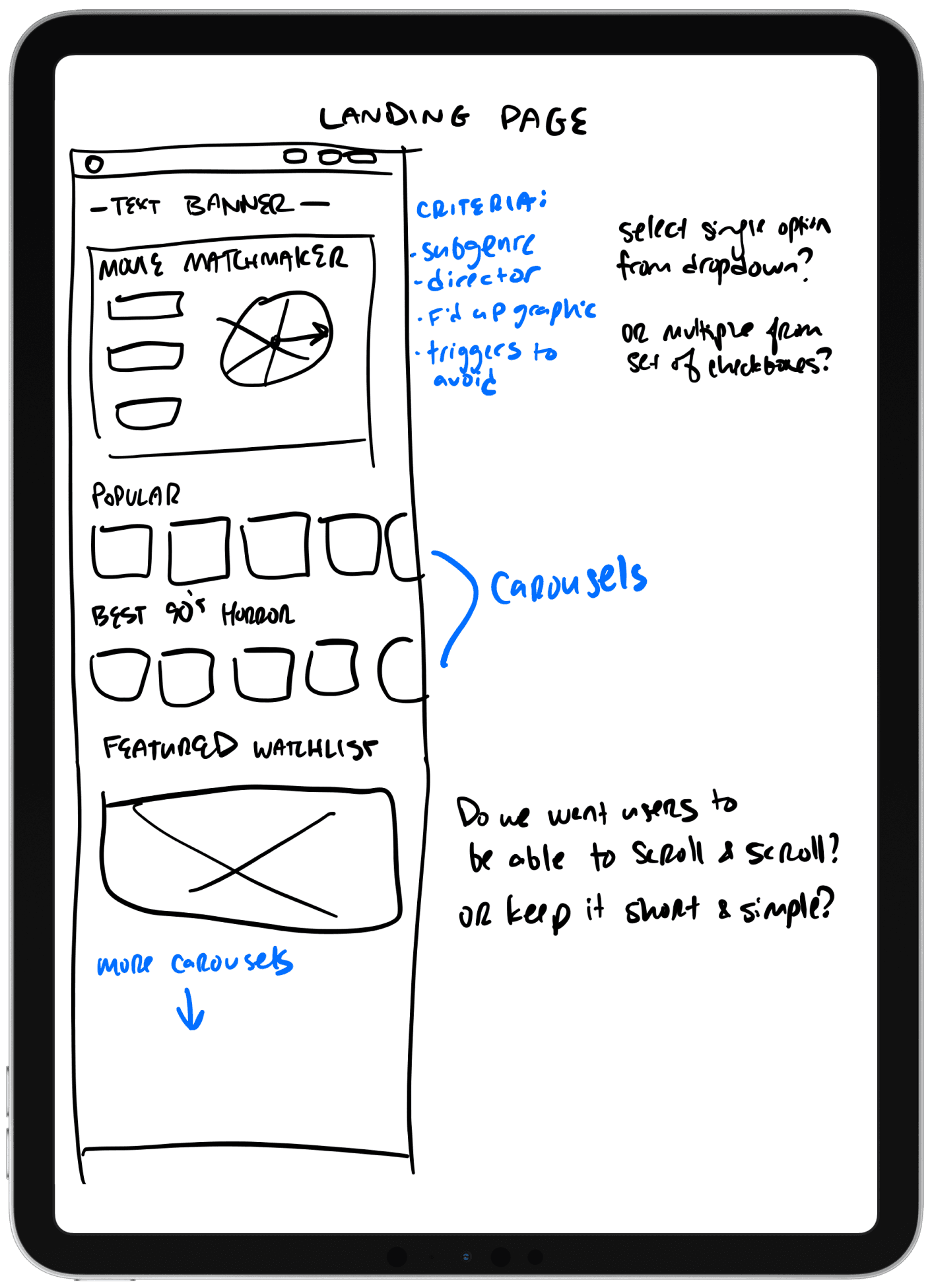
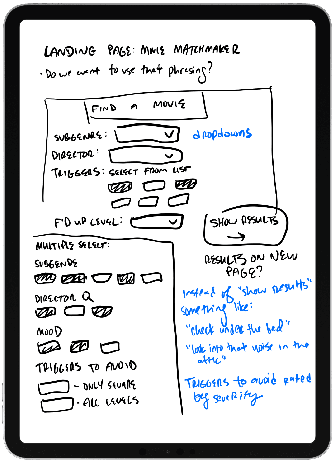
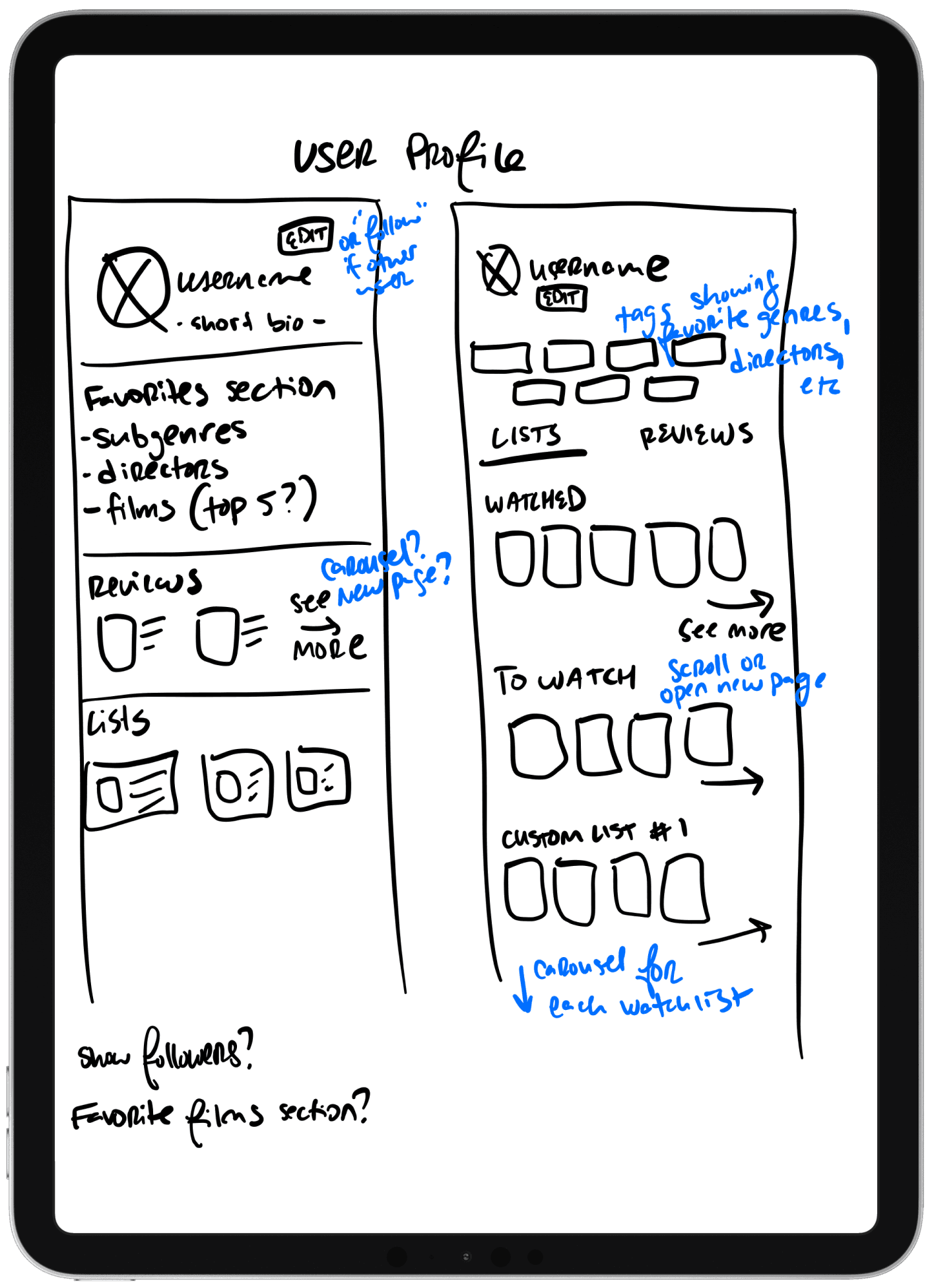
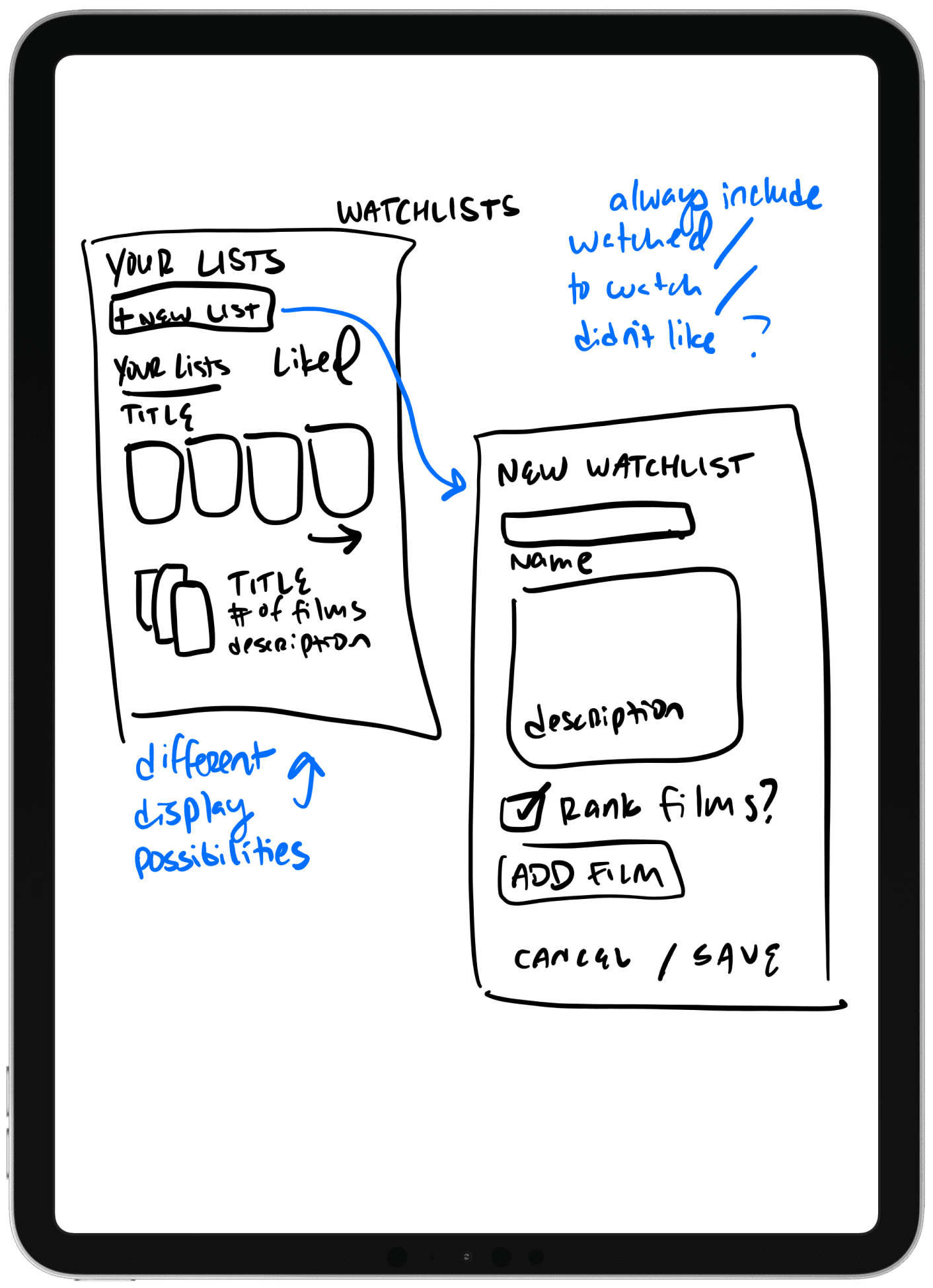
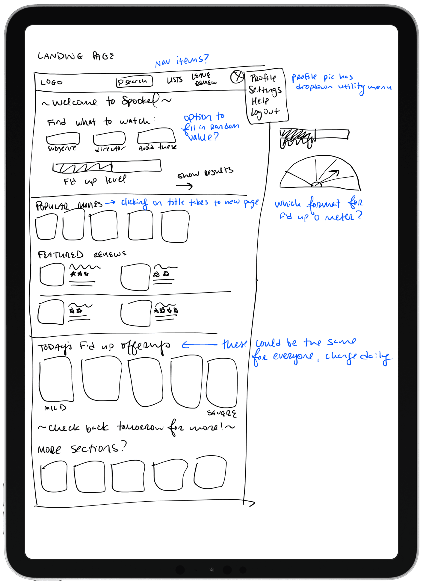
Low-Fidelity Wireframes
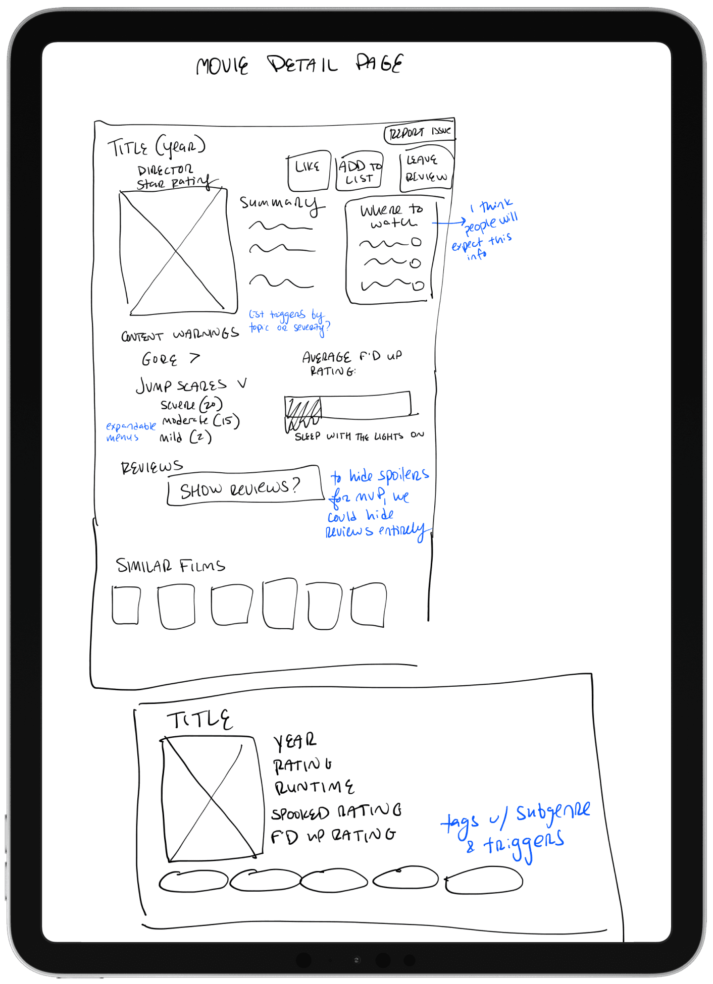
Some questions that came up after creating these wireframes:
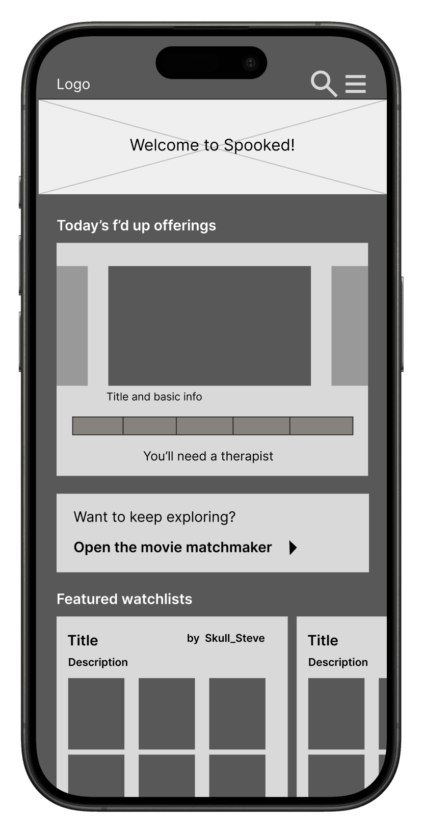
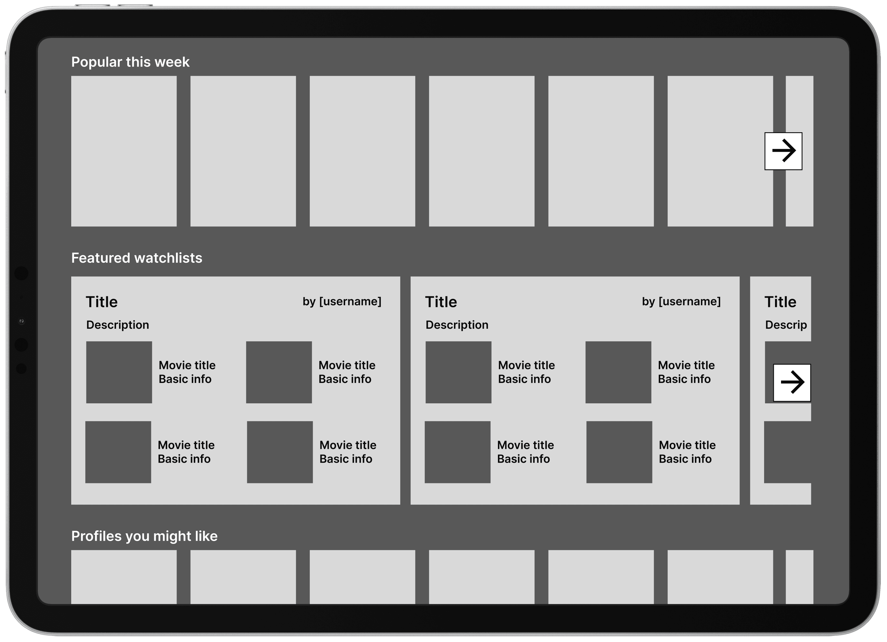
How simple do we want the home page to be? Do we want users to be able to scroll and scroll?
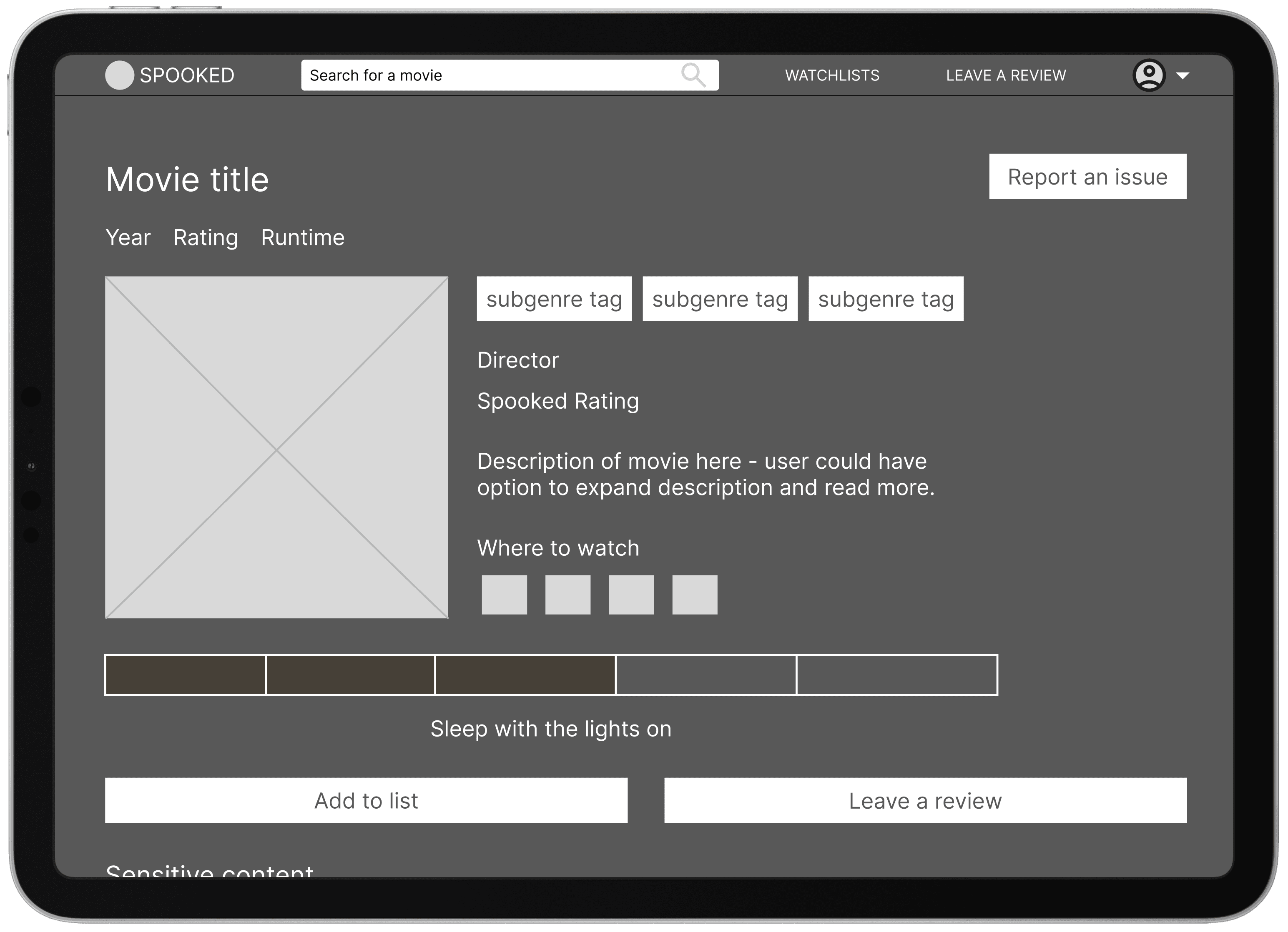
Should the F'd-up-o-meter have multiple formats or do we want to stick with the bar format?
For hiding spoilers, should we start with just hiding all reviews rather than trying to hide just the spoilers?
Mid-Fidelity Wireframes
The branding gets a facelift
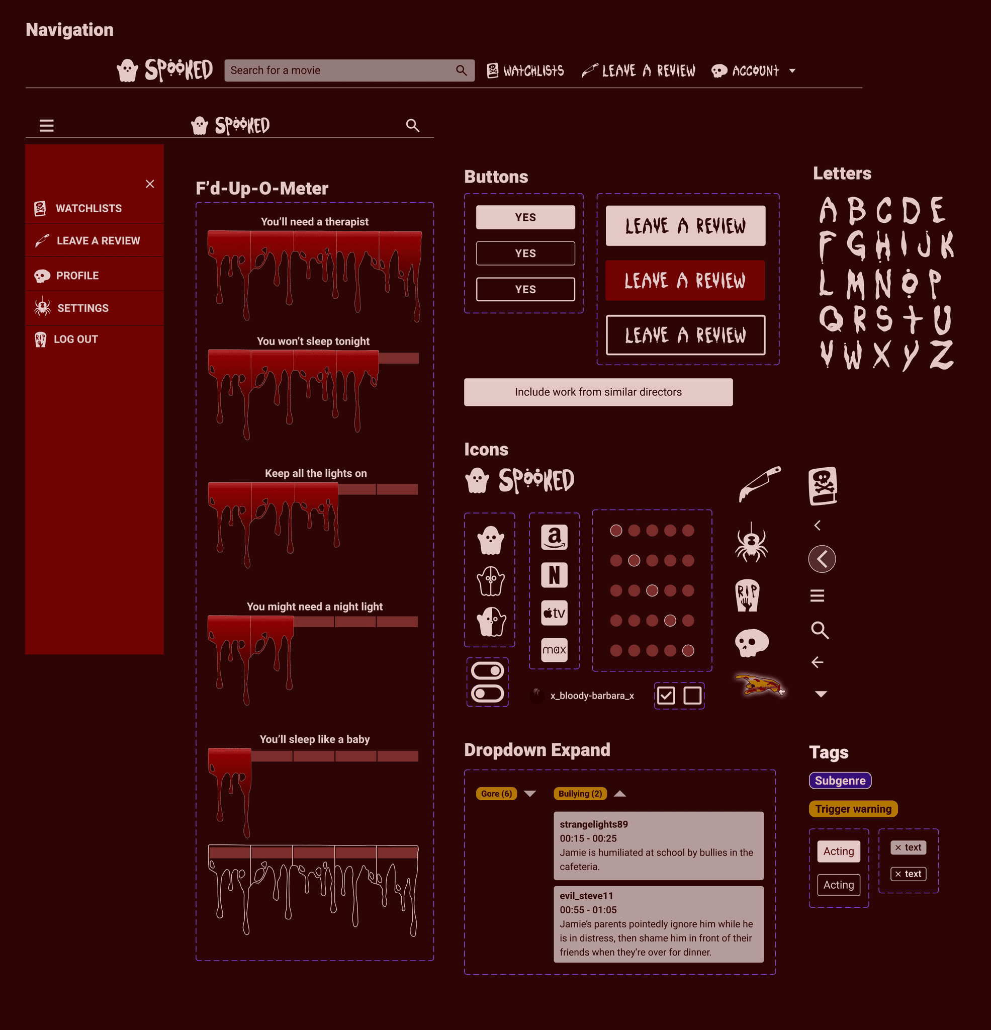
The clients had a basic idea of branding elements but needed a new logo and custom icons.
The final logo, including the ghost icon used elsewhere in the app.
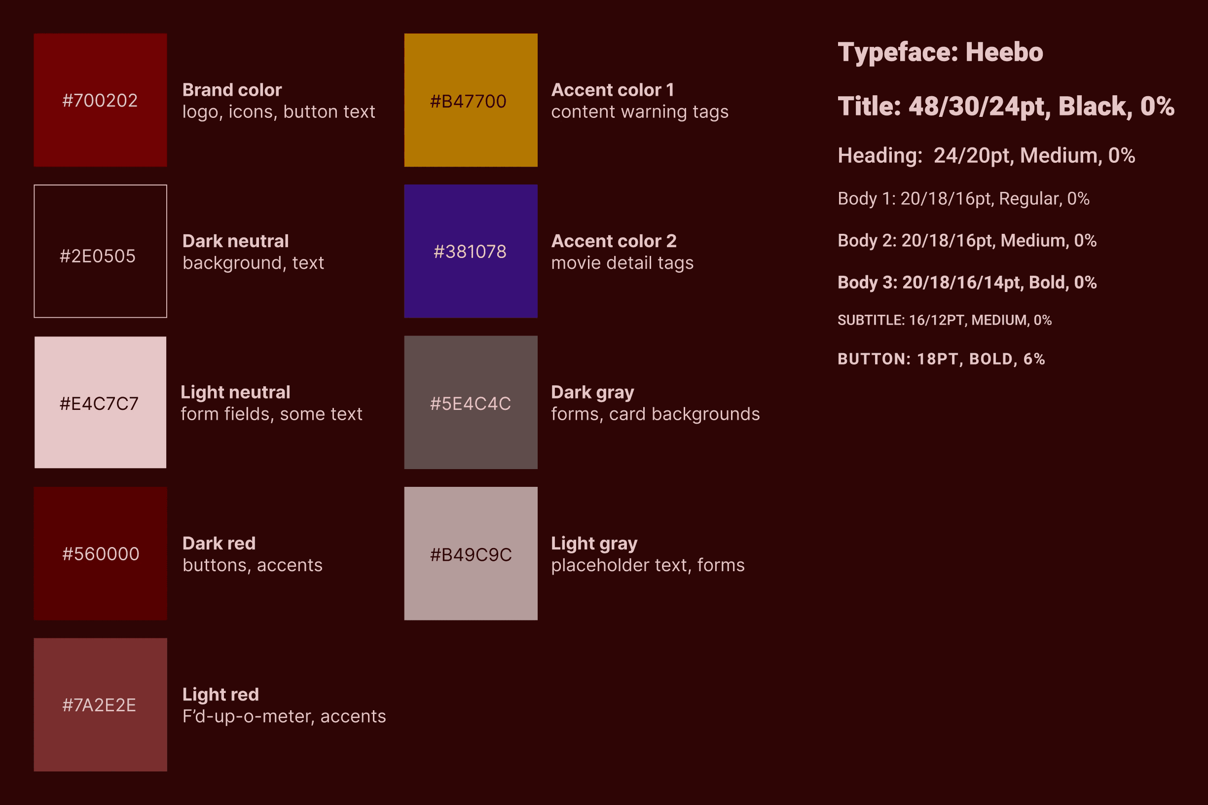
Any color combination used for text passed a WCAG AAA check.
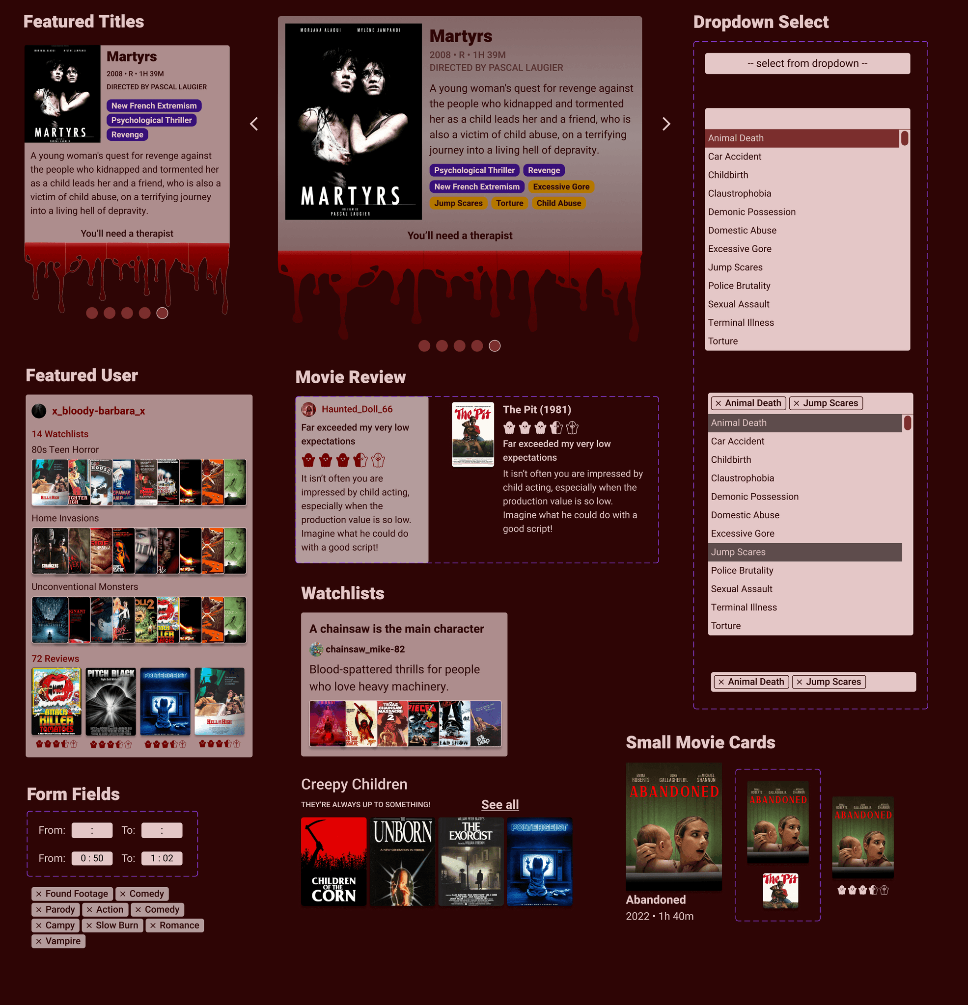
UI Component Library
Bringing the pieces together in high fidelity
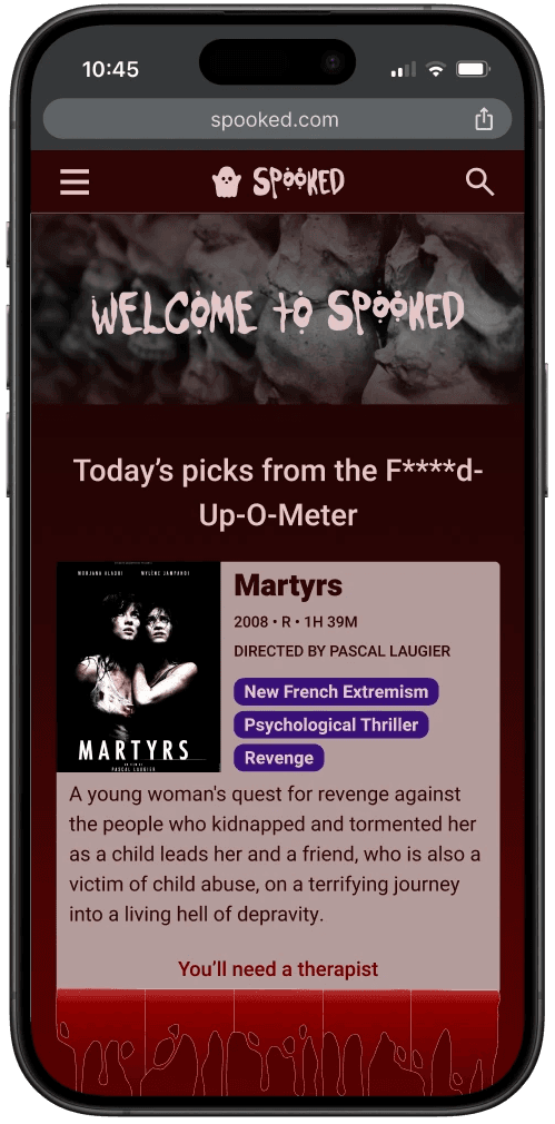
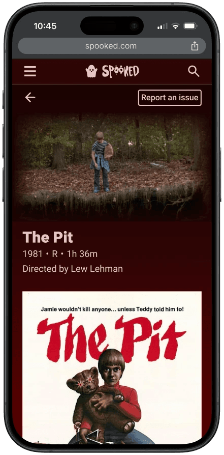
I focused on the mobile layouts per the clients' preference.
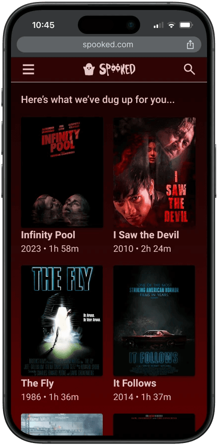
Landing Page
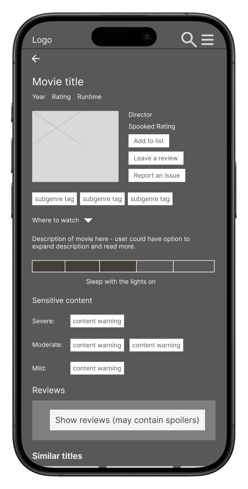
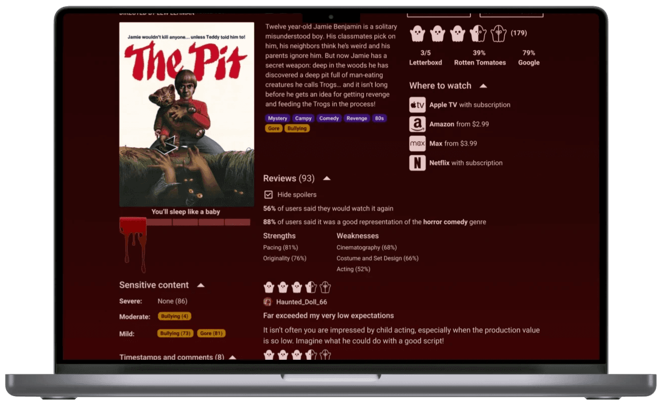
Movie Detail
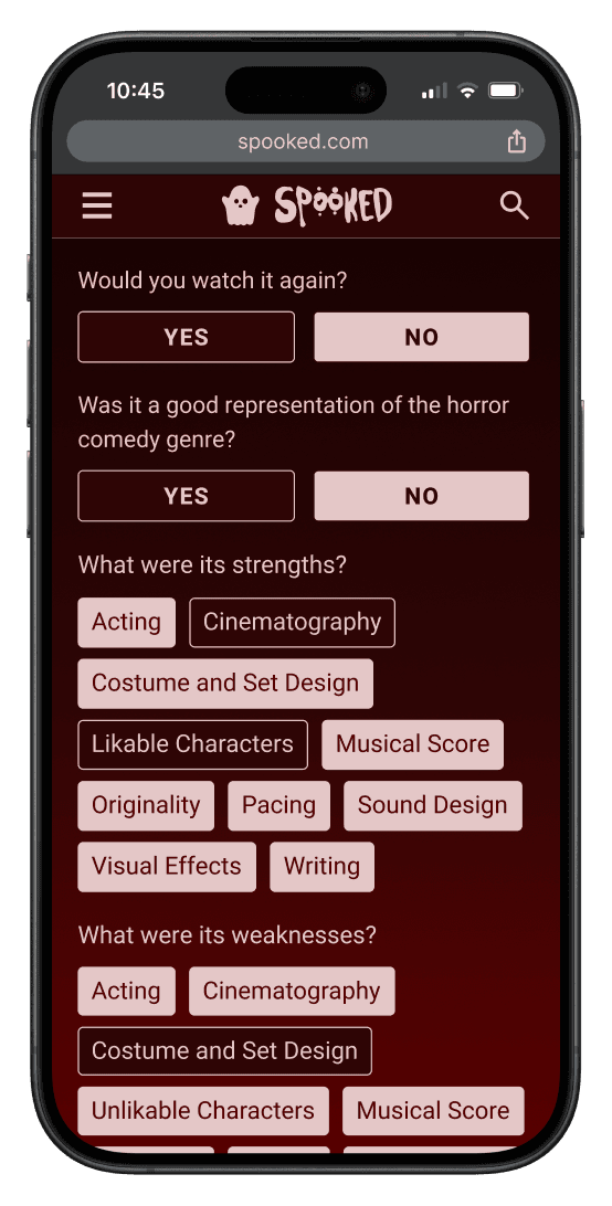
Leave a Review
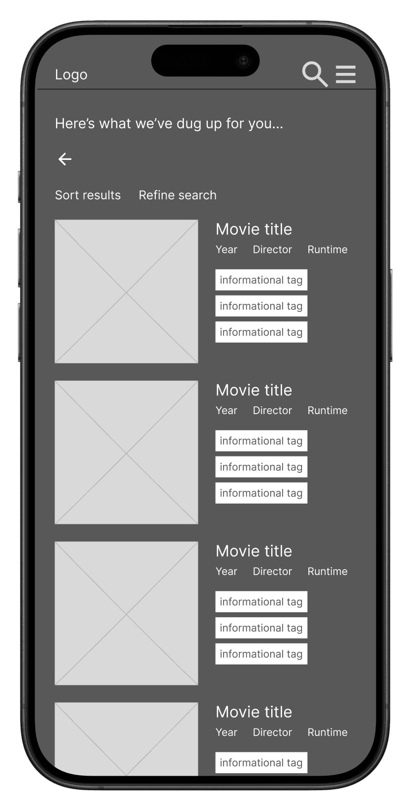
Search Results
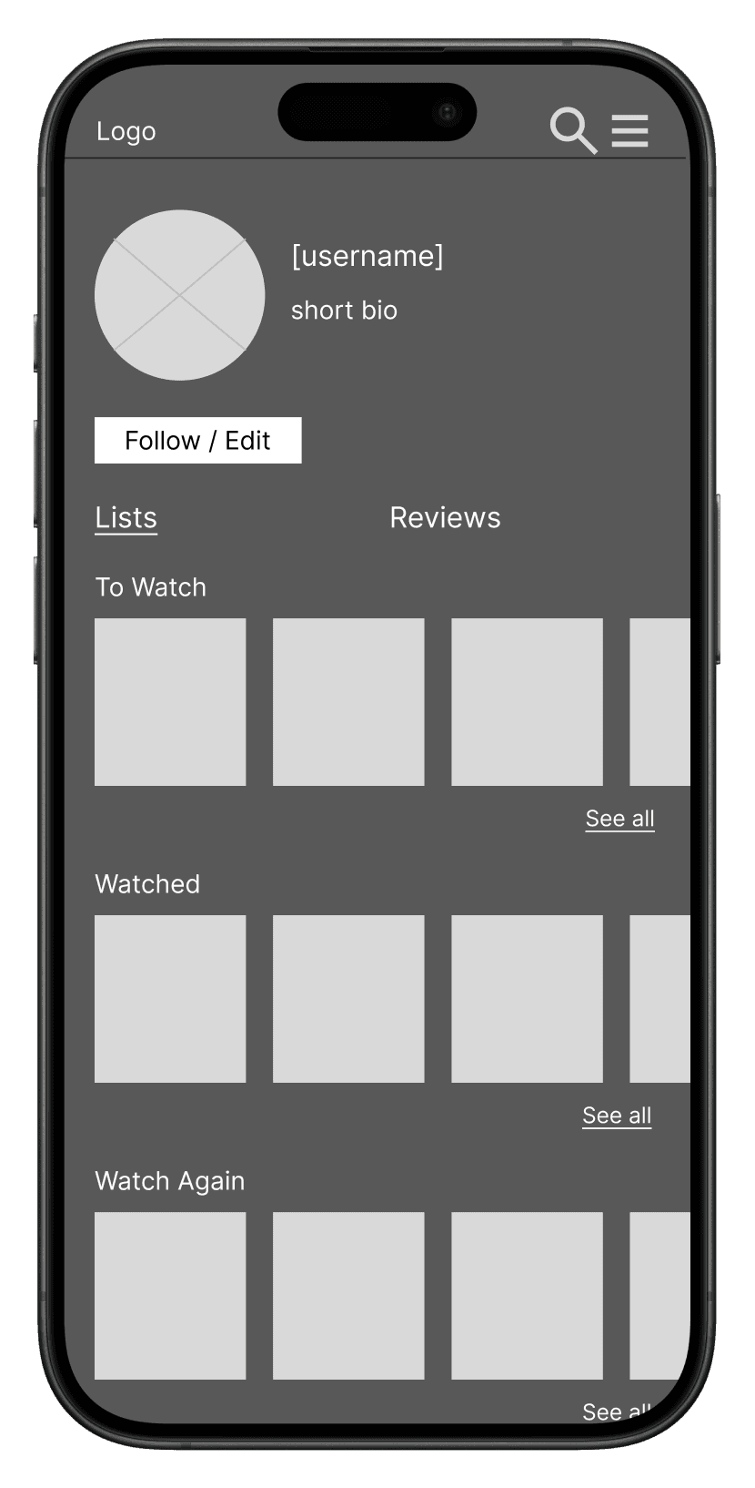
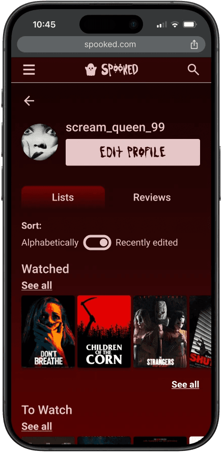
User Profile
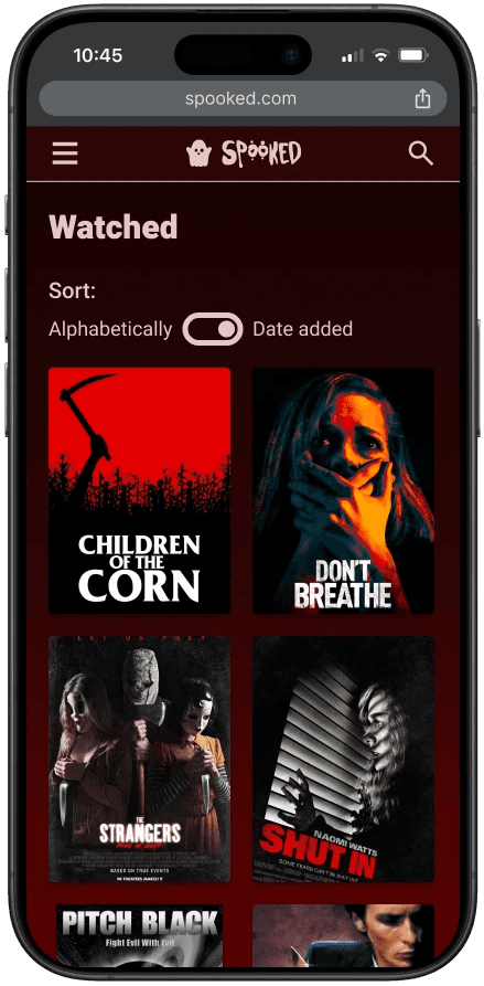
Watchlists
Testing shows lots of promise from a niche group eager for community
Like other projects, the research objectives and success metrics were pretty simple: see whether users can complete the tasks easily and without frustration, and then ultimately see if they'd use the site in its current realization.
I tested these user flows:
Navigate to a movie detail page.
Leave a review.
Use the Movie Matchmaker to find recommendations, and then iterate on search results.
Some questions I wanted to address:
How important do people think it is to see a film’s trigger warnings compared to its other basic information?
Are people satisfied with the methods used to hide spoilers?
Are people satisfied with the types of criteria they can search for in the movie matchmaker?
Can people easily use the F’d-Up-O-Meter without accidentally pushing other buttons or experiencing some other frustration?
If someone already uses Letterboxd, do they see a unique value in this app compared to that one?
I tested the screens with four participants, some remotely and some in person. I analyzed my findings with a 2x2 matrix with the four categories: Went Well, Problems, Questions, and Ideas.
Overall impressions about Spooked and its usability:
“It just flows really nicely…. I like how specific it gets without being overwhelming.”
“I love this. I feel like this is something that I’ve never seen.”
“I honestly didn't expect to like it as much as I did …. Very intuitive and visually pleasing for me.”
“I like that this is genre specific. And I think that horror movie people are really passionate. So I think that this is a good idea for people who are very passionate because I think that they'll use all the features.”
“I would absolutely use it, because it would be able to help me be more specific about my searching instead of just ruling out every single horror movie. I'd watch more if I could be more informed about my searching.”
Positive major outcomes:
3 out of 4 would definitely use Spooked
3 out of 4 are satisfied with self-reported spoilers
4 out of 4 found the Movie Matchmaker easy to use and appreciated the concept
4 out of 4 liked the design of the F'd-Up-O-Meter and used it with no issues
Opportunities for improvement:

4 out of 4 said that trigger warning tags shouldn't be displayed on movie cards

2 out of 4 needed clarification on how to report trigger warning information

2 out of 4 needed clarification on the iterative search option: “Show me movies that don't match as well”
Opinions about some UI elements:
“I would not gradient the background… It just reminds me of an older style website from like, early 2000s where every background is just a static background image.”
“I hate this font …. I think it feels cheesy. I also don’t like that the capitalization is not uniform. But I’m really picky.”
“I really liked the bloody font vibes…. I think this really speaks to if you were a big horror fan, like yes, you would absolutely utilize this. I love the little ghost emojis.”
Responding to user feedback with a cleaner design
Simplifying the colors and button text
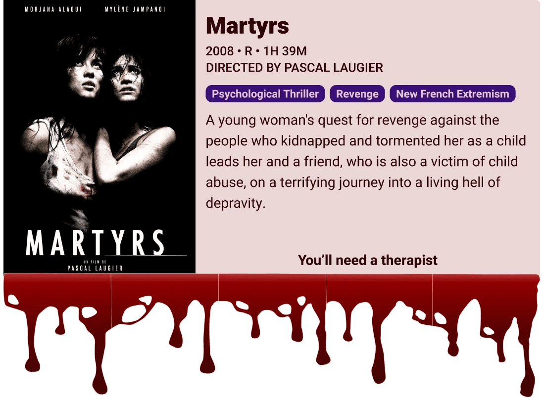
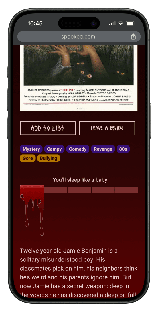
Version 1
Button default is light, and selected is dark.
Background has color gradient.
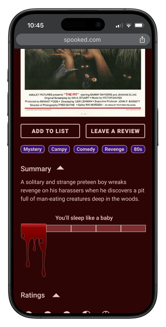
Version 2
Button default is dark, and selected is light.
Background is solid color.
Version 1
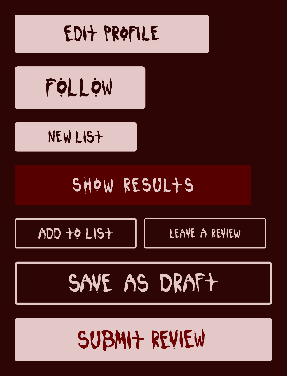
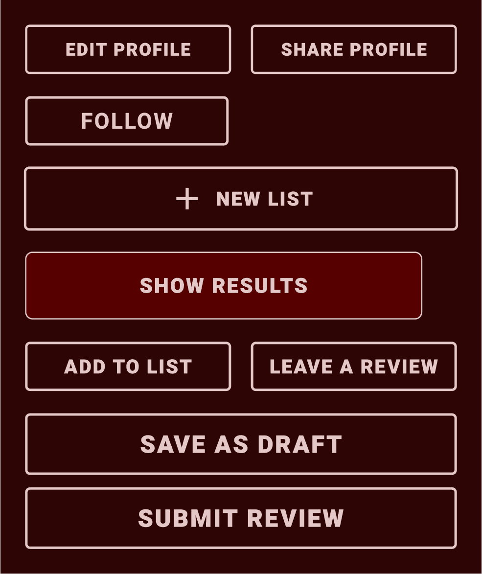
Most button text consists of the homemade bloody typeface.
Version 2
All button text consists of a standard typeface, with intention to keep refining the other.
Obscuring the trigger warning tags
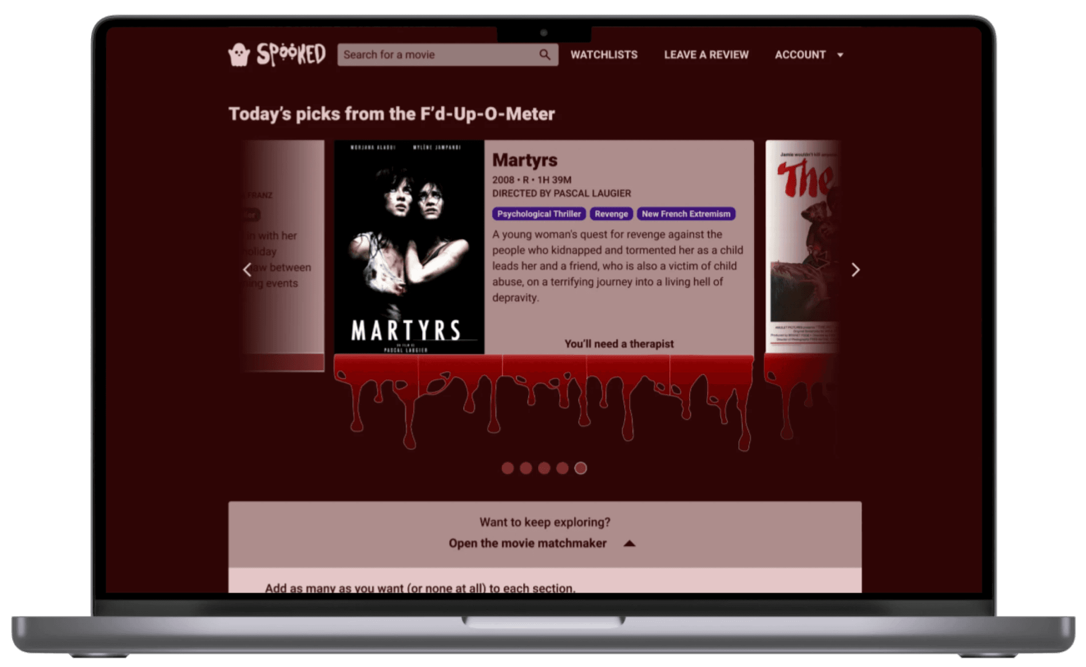
Desktop movie cards: V1
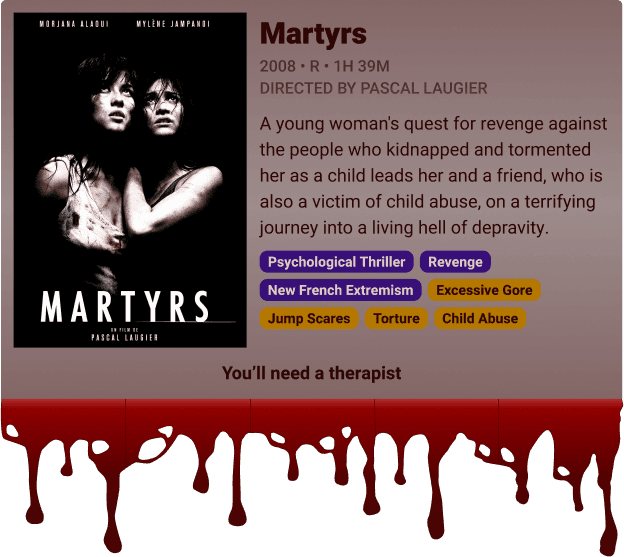
Cards in the featured movie carousel include tags for trigger warnings.
Card backgrounds have color gradient.
Desktop movie cards: V2
Cards no longer have tags for trigger warnings.
Removed the color gradient and improved text contrast.
Movie detail page: V1
Includes trigger warning tags next to genre tags.
Trigger warning info also in “sensitive content” section.
Movie detail page: V2
Trigger warning info removed from prominent movie info, can only be found in the “sensitive content” section.
Clarifying the process of reporting sensitive content
Leaving a review: V1
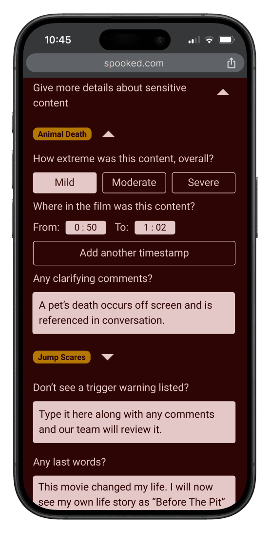
Users had to select trigger warning from list twice: when leaving a timestamp, and when leaving a descriptive comment.
Users could not report the severity of sensitive content.
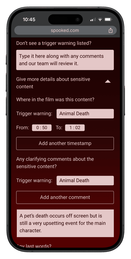
Leaving a review: V2
Users can now report severity of sensitive content.
Users start with a static list of previously indicated trigger warnings so that they don't have to input the same info multiple times.
Updating the search result options
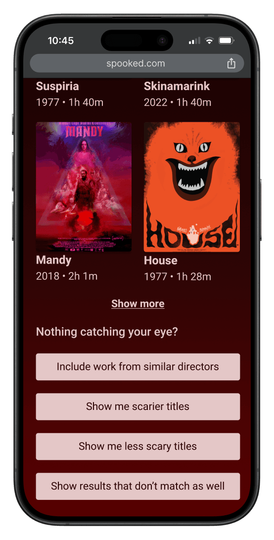
Search results: V1
Fourth iterative search option uses vague language.
No option to quickly add a title to a list on the same page.
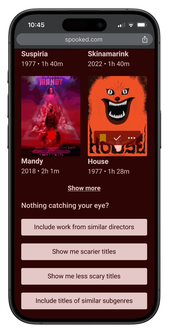
Search results: V2
Fourth iterative search option uses more specific language.
Users can add a title to any list without leaving the page.
Desktop Screens
To be continued…
I plan to keep working with the clients on further iterations. We have a long list of potential features that would be great to have, but these will probably be priority items:
More extensive usability testing
Quick view of movie details in search results
Collaborative watchlists
Continued development of branding and UI components
More sections in the user profile, such as “Top 8 movies” or badges
Video peeks at the major user flows (so far)
Browse the landing page
Browse a movie detail page
Leave a Review
Use the Movie Matchmaker
Use the iterative search feature
Browse profile page
Lessons for my future work
Main takeaways
People have varying preferences for which movie information they want to see before watching it, including whether trigger warning information should be immediately visible.
Working with clients brings a new level of challenge to a project, but I appreciated the way that their preferences guided my choices.
What I'll do differently next time
Focus less on super detailed roadmapping for features that are coming much later.
Avoid using so many color gradients. It's a quick way to add some embellishment, but often it just makes the UI appear dated.
Major Challenges
The timeline of this project took longer than a solo project, since there was additional communication and brainstorming with the stakeholders.
Getting some negative feedback about the custom typeface was humbling, but it was a good reminder of how I can't get too attached to my own creations if they just don't stand up to user feedback.
What I'm proud of
I had fun with this project, which I think shows in the writing personality of the text on the screens.
I feel good about how the icons and logo look, especially the ghost ratings. I look forward to designing more.
The clients are happy with what I've designed, and I'm looking forward to continuing this project with them.


